New Features
1. New User Interface
2. Knowledge Center
3. User-Initiated Action - Create Record
4. Stage and Process Duration
5. Time Delta Option
1. New User Interface
In Release 50 we have implemented UI changes that will better facilitate our customers’ need for quicker access to important information and streamlined navigation throughout the system.
UI changes are visible on the Home Page, Process Page, and the Views page.
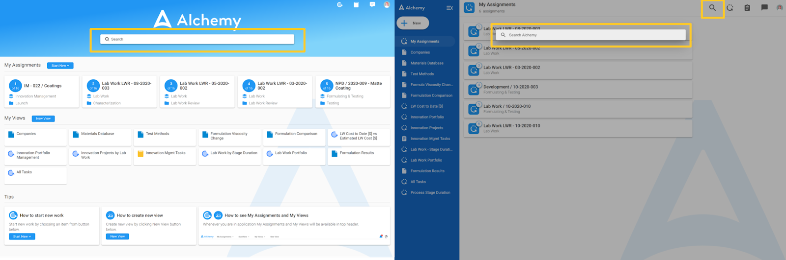
Home Page
When a User signs in, a new Home Page layout is now available. The primary difference is a reorientation from horizontal cards to fixed left navigation which we call our left sidebar menu with lists. The left sidebar will enable navigation with fewer clicks, provide more clarity for reaching desired data, and create an overall better user experience.
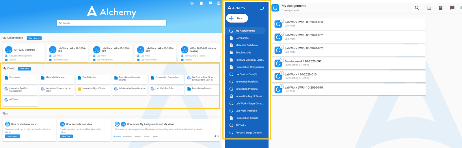
The left sidebar menu will contain links to both key actions (e.g., starting a new process or a new view) and relevant information for users such as My Assignments and Views, and it will always be there to help you navigate efficiently through Alchemy.
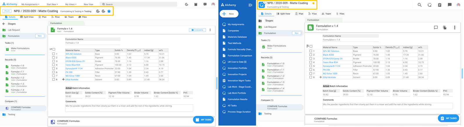
In the screenshot below, you can see a side by side comparison of the previous and new Home Page.
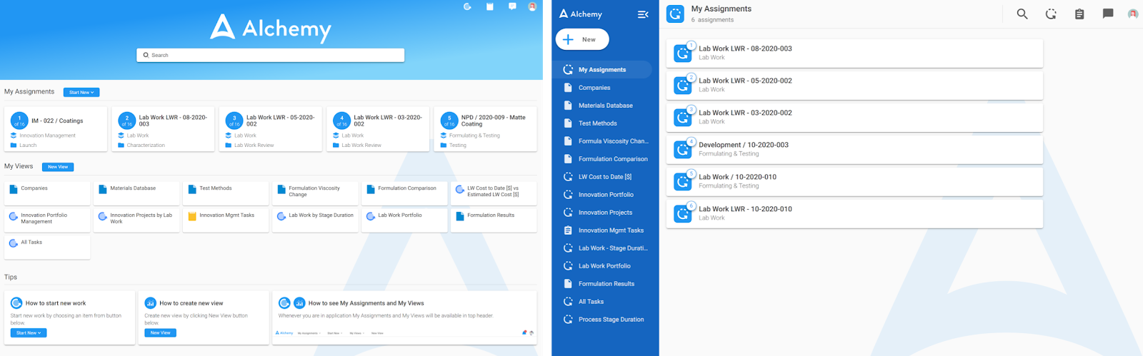
By default, the Home Page is the 'My Assignments.' When you navigate away from My Assignments, they are always 1 click away by clicking the top menu item ‘My Assignments’ in the left sidebar menu. When clicked it will take you right back to your assignments. The new location is viewable below.

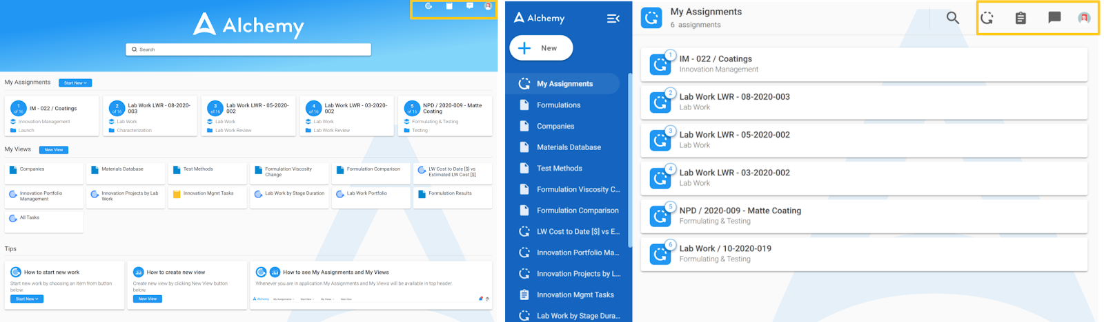
The new location for My Views on the home page section is also in the left sidebar menu right below My Assignments. Compared to the previous version where the Views were aligned horizontally and presented as cards, Views are now menu items in the left sidebar menu as shown in the right screenshot below. Please note to make more space on your screen for your work, you can collapse the left sidebar menu by clicking this icon:
And you can reopen it again by clicking this icon:
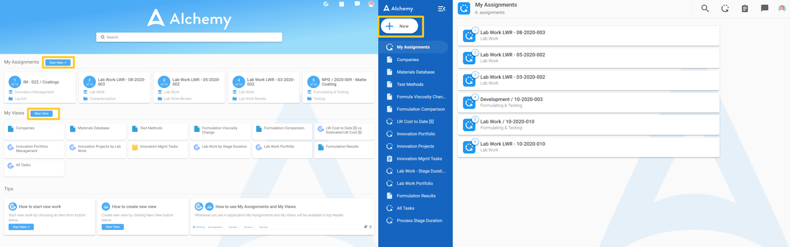
The ‘Start New’ and ‘New View’ buttons are now replaced with a prominent white more universal ‘+ New’ button on the upper left corner of the left sidebar menu. Since the sidebar is available throughout the app, this + New button is easily reached on any page in the app without having to click out first which makes starting a new process or making a new view faster and easier to do from anywhere.
The search bar is now condensed into the magnifying glass icon in the app header. When you click it, the page you are on will grey out and the search bar will appear where you can enter what you are looking for.
The icons in the upper right corner of the app header at the top have stayed in the same place with subtle design improvements.
Process Page
The Process Page has mainly stayed the same with the exception of the process and record headers and, of course, the addition of the left sidebar menu.
The primary changes to the Process Page are:
1 - The app header is gone since there is no need for it with the presence of the left sidebar menu. The action icons that were on its right side are now on the right side of the Process header as you can see below.
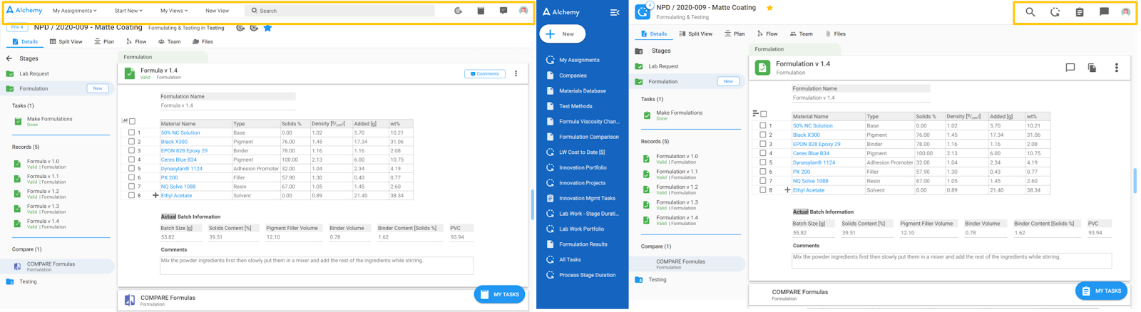
The search bar is replaced with a magnifying glass icon. When the icon is clicked, the search bar will pop up. The notification icons for processes, tasks, and comments are a bit more stylized. The User Profile icon has stayed the same.
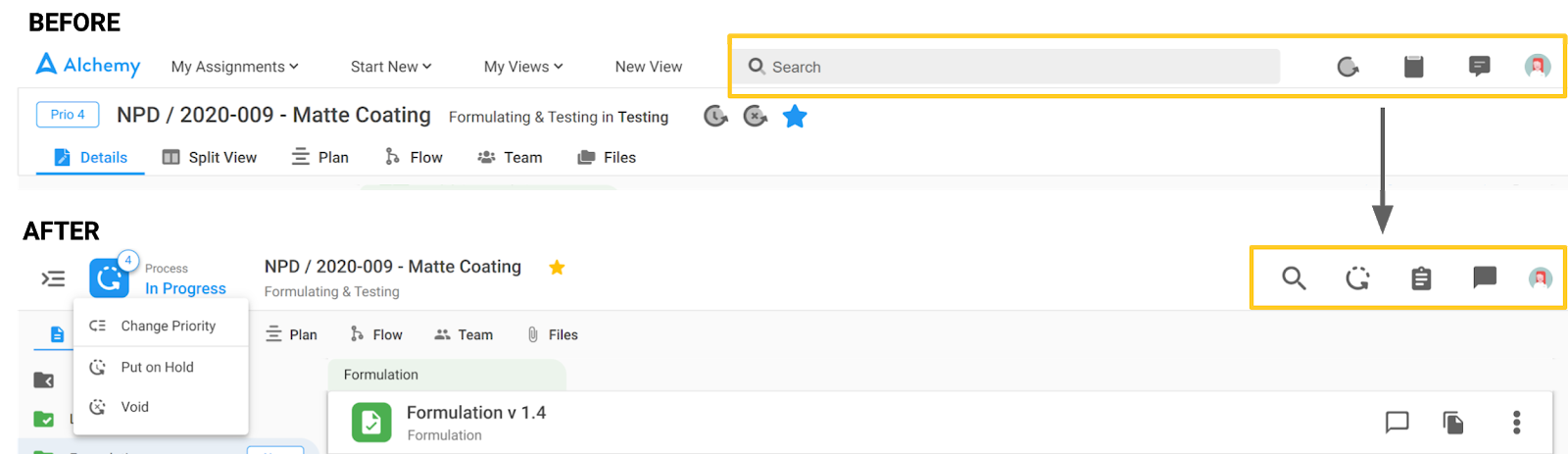
2 - The information and process controls are still in the process header, but the information and available buttons are simplified and condensed as you can see below.
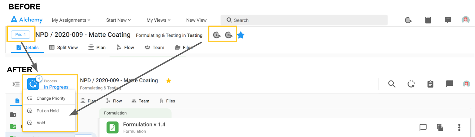
The priority information is incorporated into the process icon like this:
When you hover over the process icon, information about process status is visible as well as a drop-down for additional actions. First, process priority can be changed by clicking on ‘Change Priority.’ Secondly, the ‘On Hold’ and ‘Void’ controls are now here. In this way, the process header is cleaned up with a more simple overview.
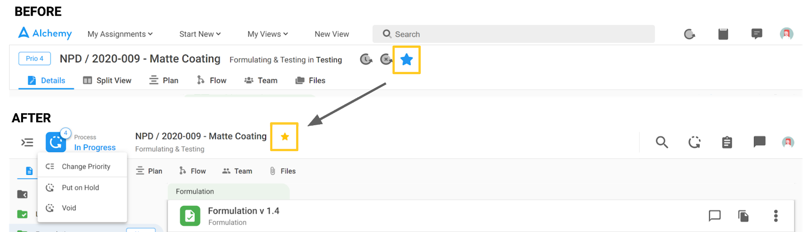
The name of the process and the information about the process template are reorganized one below the other. The following star icon has stayed in the same place.
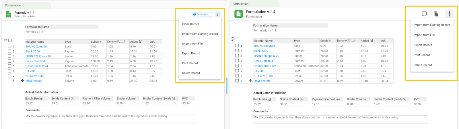
3 - The record header actions are still here with some new icons for commenting and cloning that are promoted. Other actions are available behind the 3 dots as you can see below.
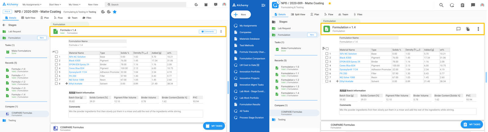
Now, if we zoom in to the Record header, we notice some changes there as well.
The first icon on the new UI replaces the former ‘Comments’ button. This icon has three versions depending on the comment status on the record.
An empty comment icon means that there are no comments on this record:
A comment icon with a red dot means there are un-resolved comments in this record:
A comment icon with a check means all comments in this record are resolved:
The second icon is for Cloning a record and it looks like this:
The rest of the actions that are available on both UIs behind the 3 dots stayed the same as you can see on the screenshot below.
Views
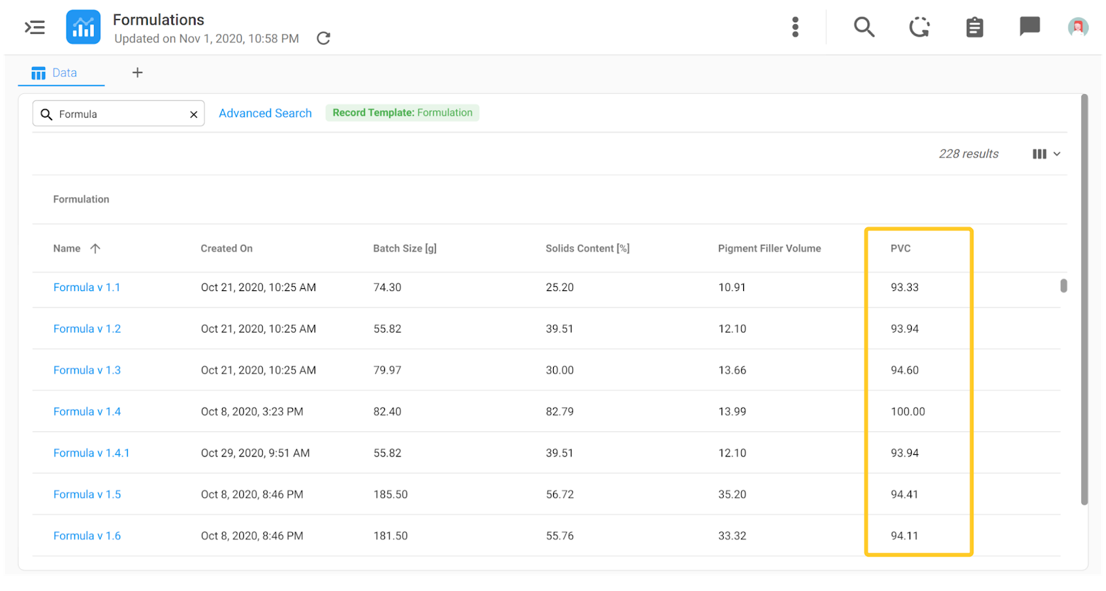
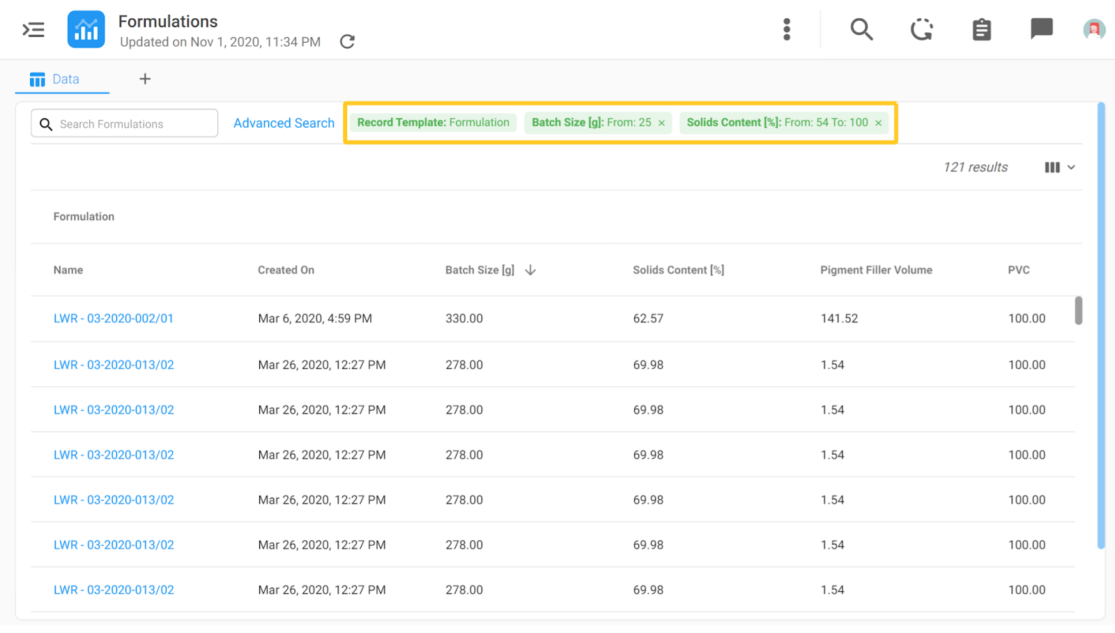
Accessing your Views is now easier since they are represented as Menu Items in the left sidebar menu. Additionally, there is a more clear and simple overview of data in Views. For instance, in the image below, you can see a list of formulations and their characteristics.
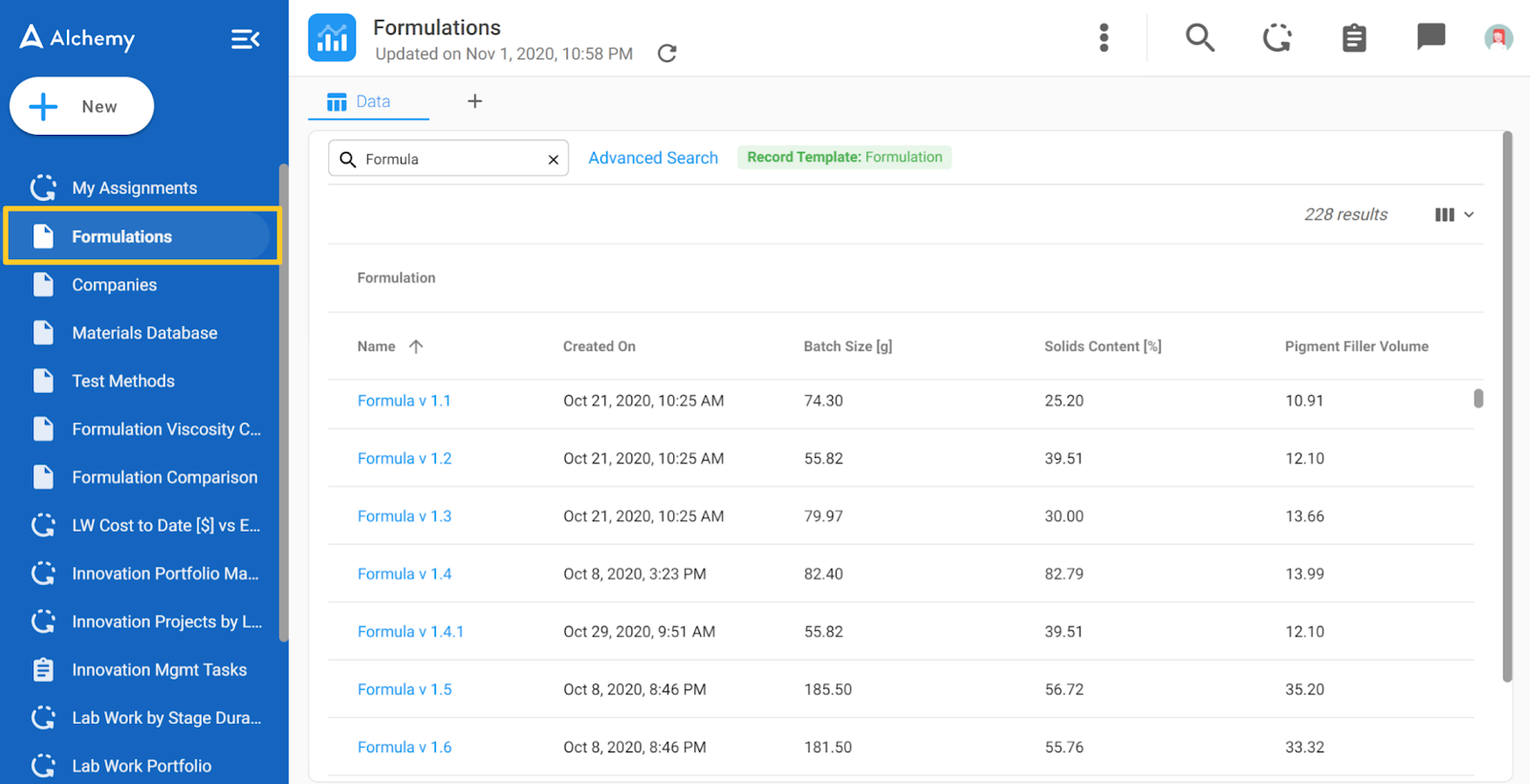
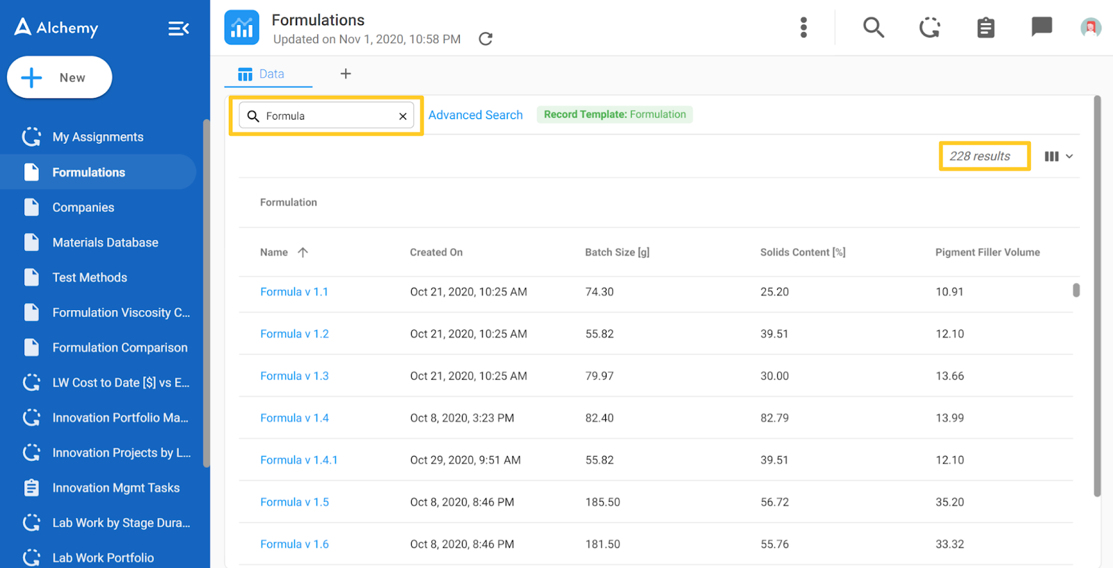
As you can see in the image below, the data in the View listed under each column header can be searched by typing keywords in the search bar. This way the data showed is narrowed according to the search criteria. Furthermore, it's clearly noted how many results are available in the upper right corner, in our case 228.
The specific columns of data that are visible in your View can be selected by clicking on the columns icon in the far right corner which looks like this:
Users can select from applicable options in the drop-down list which data they want to be visible in the View. In the example below PVC data is selected in Step 1.
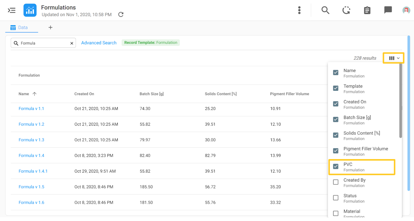
In Step 2, you can see the selected PVC data appear in a column in the View:
To refine or filter down the data further an Advanced Search Option is available next to the search bar.
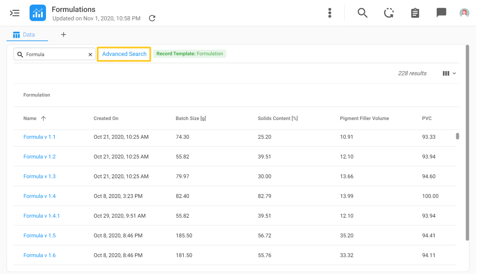
When the highlighted text ‘Advanced Search’ is clicked, a pop-up dialog box will appear where the filtering can be continued. To select more criteria for filtering, click on the ‘More Filters’ text, and select the criteria according to which you want to refine the View.
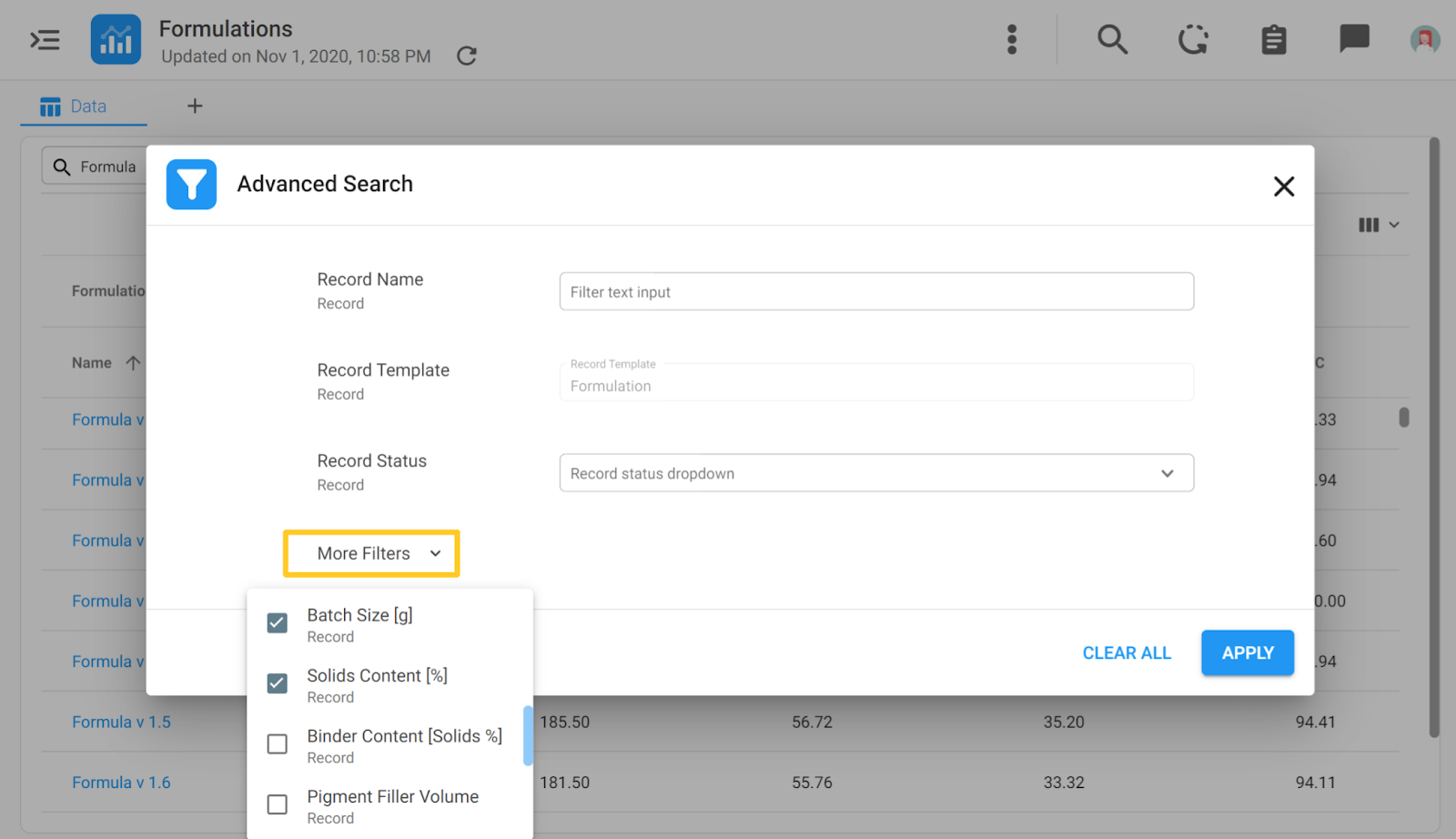
With Advanced Search, all the existing columns can be filtered according to desired values, ranges, etc. After the filtering is done, users click the ‘Apply’ button and the View will be filtered down according to the entered criteria.
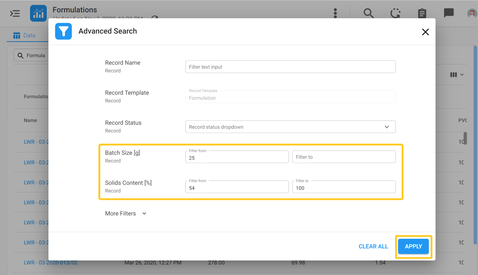
At the top of the View, you will notice green chips that are giving the user information about the filtering criteria which you have applied to filter down your data set. If you want to delete some of the criteria and expand the data set back up, you can click the small ‘x’ on the green chip.
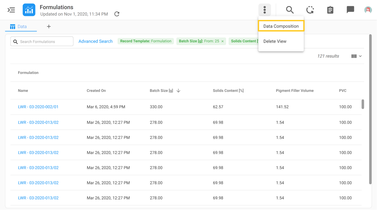
The source tab with the information about which nodes are connected is now behind the 3 dots in the upper right corner of the page and it's called the ‘Data Composition’ as you can see below.
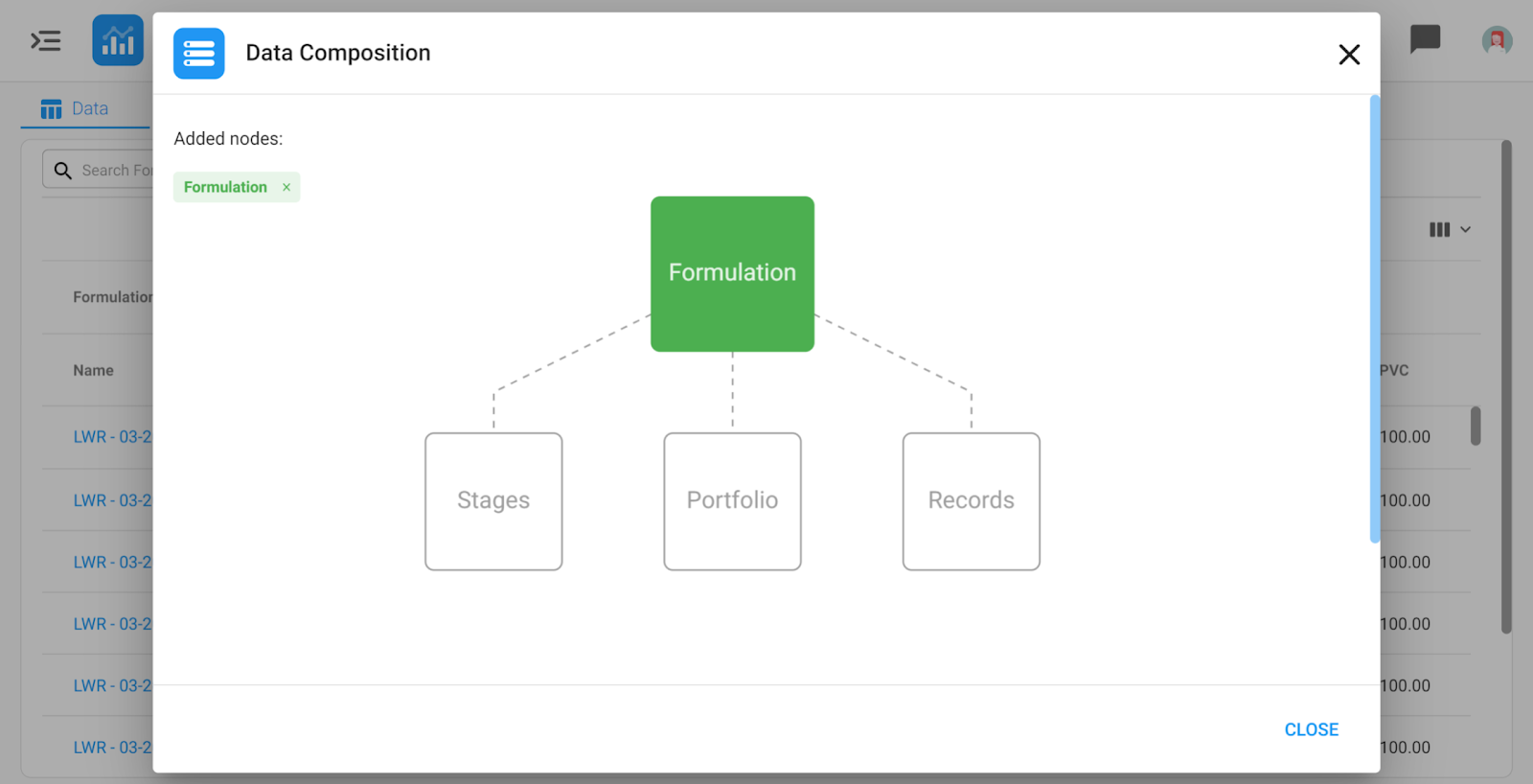
When you click on the ‘Data Composition’ a source graph with the nodes will appear. Nodes can be added the same way as in the previous versions. Nodes can be deleted by clicking the "x" on the green chips on the left-hand side.
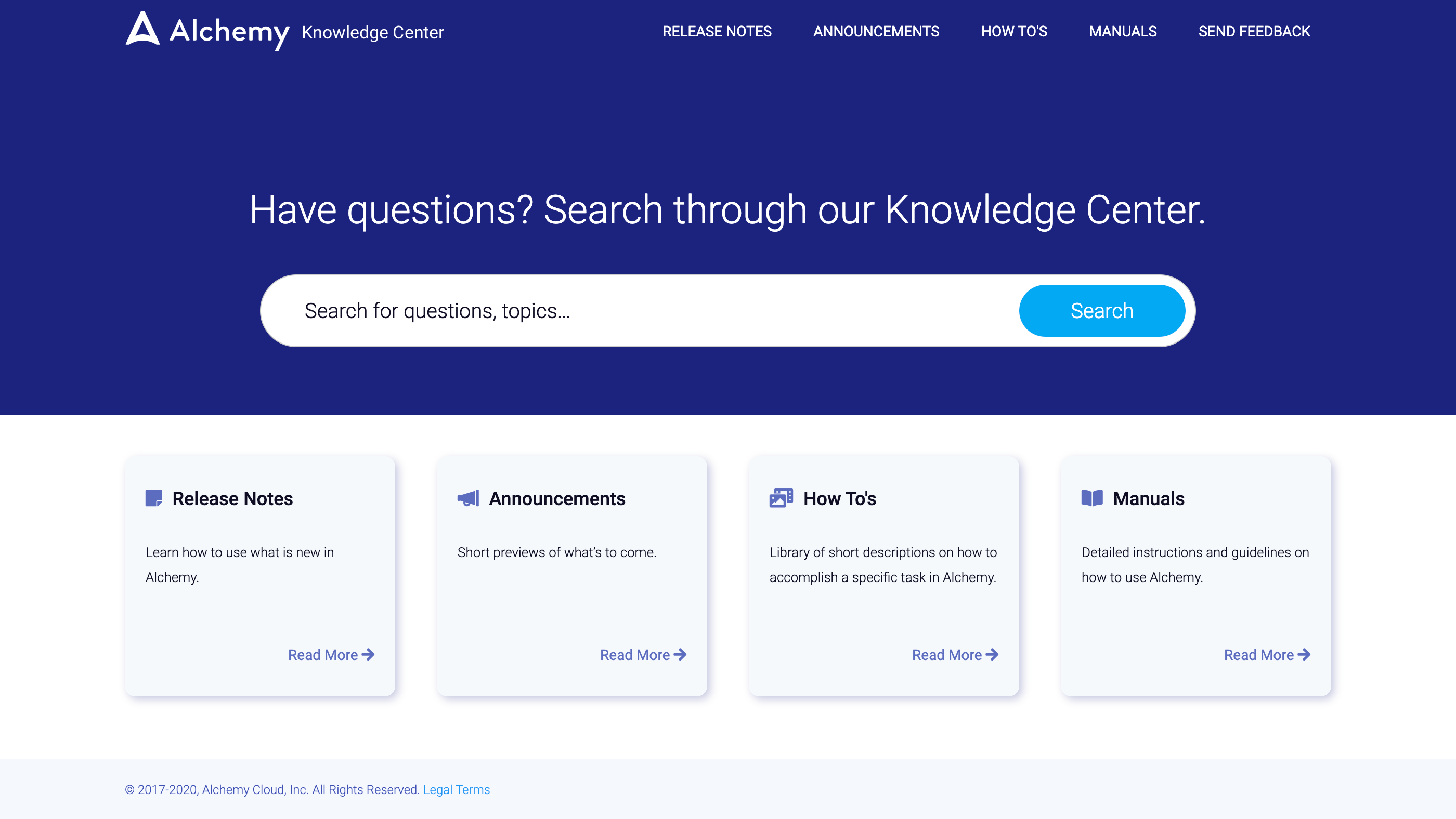
2. Knowledge Center
The ‘Tips’ section is no longer available on the Home Page allowing more visibility of the desired items in the main pane.
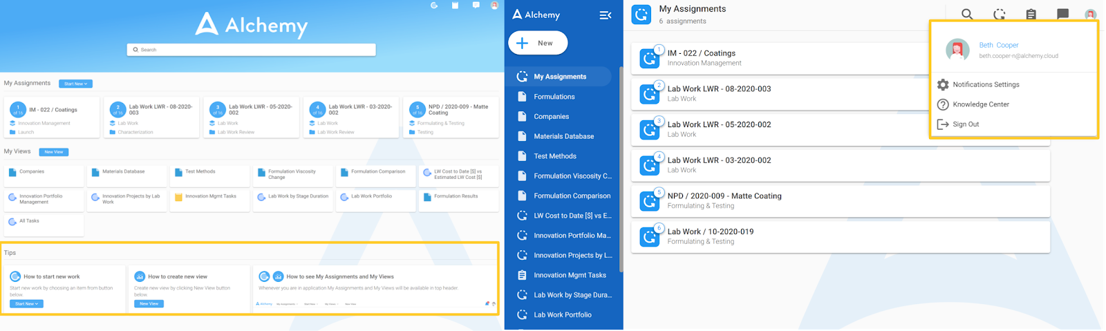
In its place we now have a much more comprehensive Knowledge Center that includes upcoming Product Announcements, Release Notes in reverse chronological order, How To’s, and our User and Configuration Portal Manuals. The Knowledge Center has integrated a text-based search of the content contained within it and a Feedback Form. The Knowledge Center is accessible by clicking your profile icon that looks something like this:

Then select the question mark Icon:
This will pop a new browser tab where the whole Knowledge Center is available. You can see the Homepage of the Knowledge Center below.
3. User-Initiated Action - Create Record
In Release 49.0 notes we covered User-Initiated Actions in a Record and provided a couple of examples. In Release 50.0 this feature is enhanced. We added more capabilities to User Initiated Actions in Records specifically.
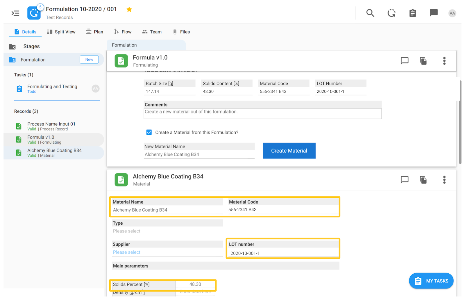
In the example below, we demonstrate the use case of a formula becoming classified as a new raw material that can be used later in other formulas.
In the image below you can see a Formulation Record with a formula table containing ingredients and other relevant info.
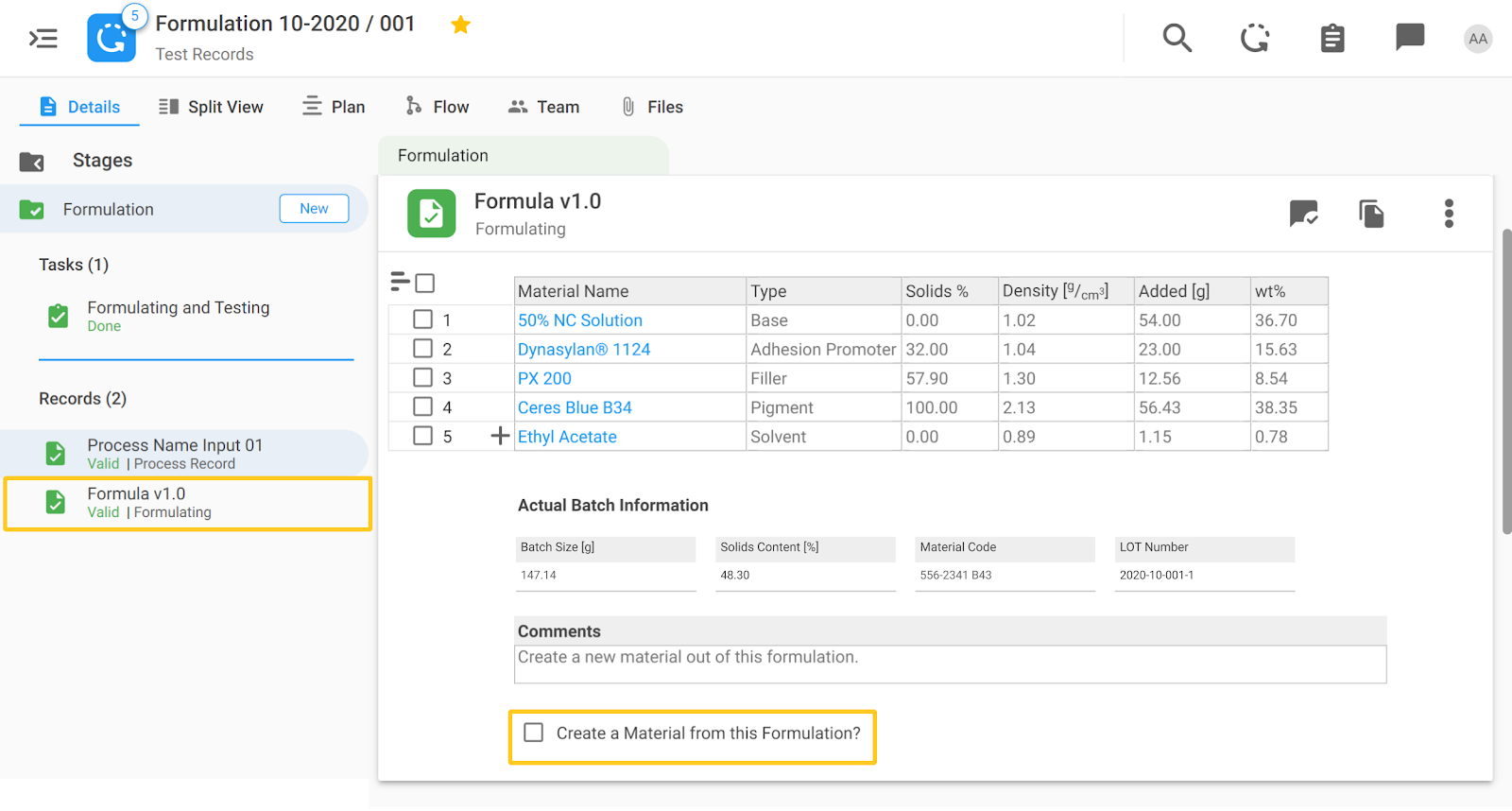
If it is determined that this formula should officially be classified as a new raw material, check the box at the bottom labeled ‘Create a Material from this Formulation?’ When the checkbox is clicked, an additional field called ‘New Material Name’ is visible and a button ‘Create Material.’ The new name of the Material should be filled out as well as some additional parameters like the Material Code and LOT Number. These fields will be populated automatically in the new material record.
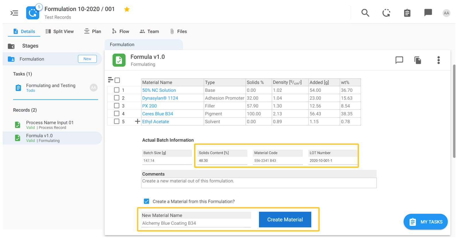
The fields to be auto-populated are configurable, so if you are interested in this feature, we will set it up to auto-populate what you need.
When you click on the ‘Create Material’ button a new Material record with the defined name will automatically be created in the system for future use.
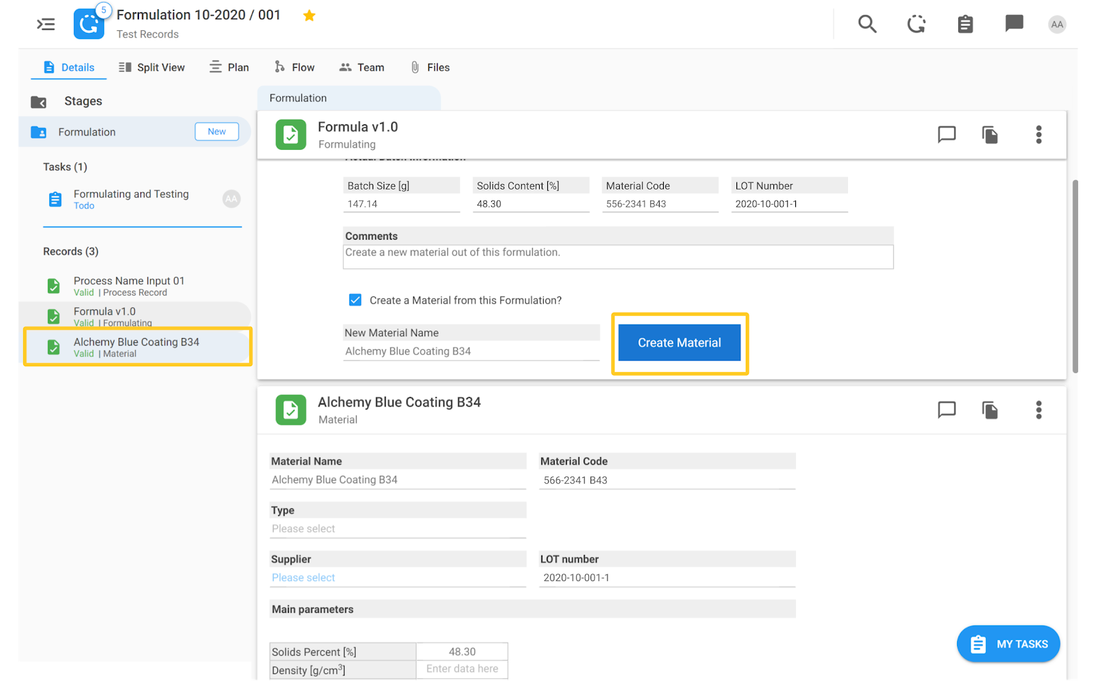
The name of the new record is what we've entered in the ‘New Material Name’ field in the Formulation record. Additionally, the Solids Content [%], Material Code, and LOT Number information are auto-populated in the newly formed Material record.
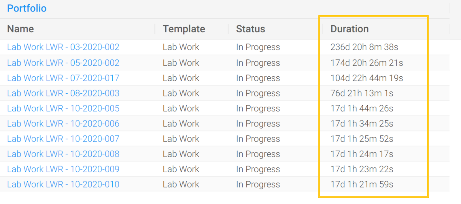
4. Stage and Process Duration
Stage and process durations are now calculable even when they are still active i.e., not yet completed.
In our previous versions, stage durations were available only for stages that were completed. In Views, if such a report was set up, the durations could only be calculated for stages that were completed by the system. Now, duration data on active stages enables more granular and more comprehensive reporting capabilities.
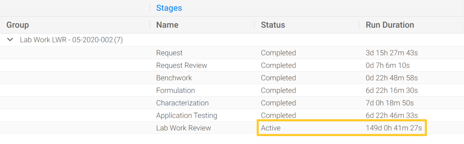
Duration for processes that are in progress is also being calculable and reportable as seen in the image below.
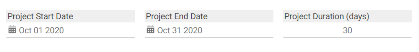
5. Time Delta Option
Subtracting the start date from the end date to calculate duration is now possible.
The start and end dates of projects provide valuable information about the duration of a project. This time delta functionality can also be used for other purposes e.g., for calculating the storage time of a certain sample if the ‘best before’ date is known. In this example, the duration of a project is estimated by subtracting the start date from the end date. This needs to be configured on our Configuration UI, so please contact your CS Manager if you want to include this feature in your Alchemy implementation.