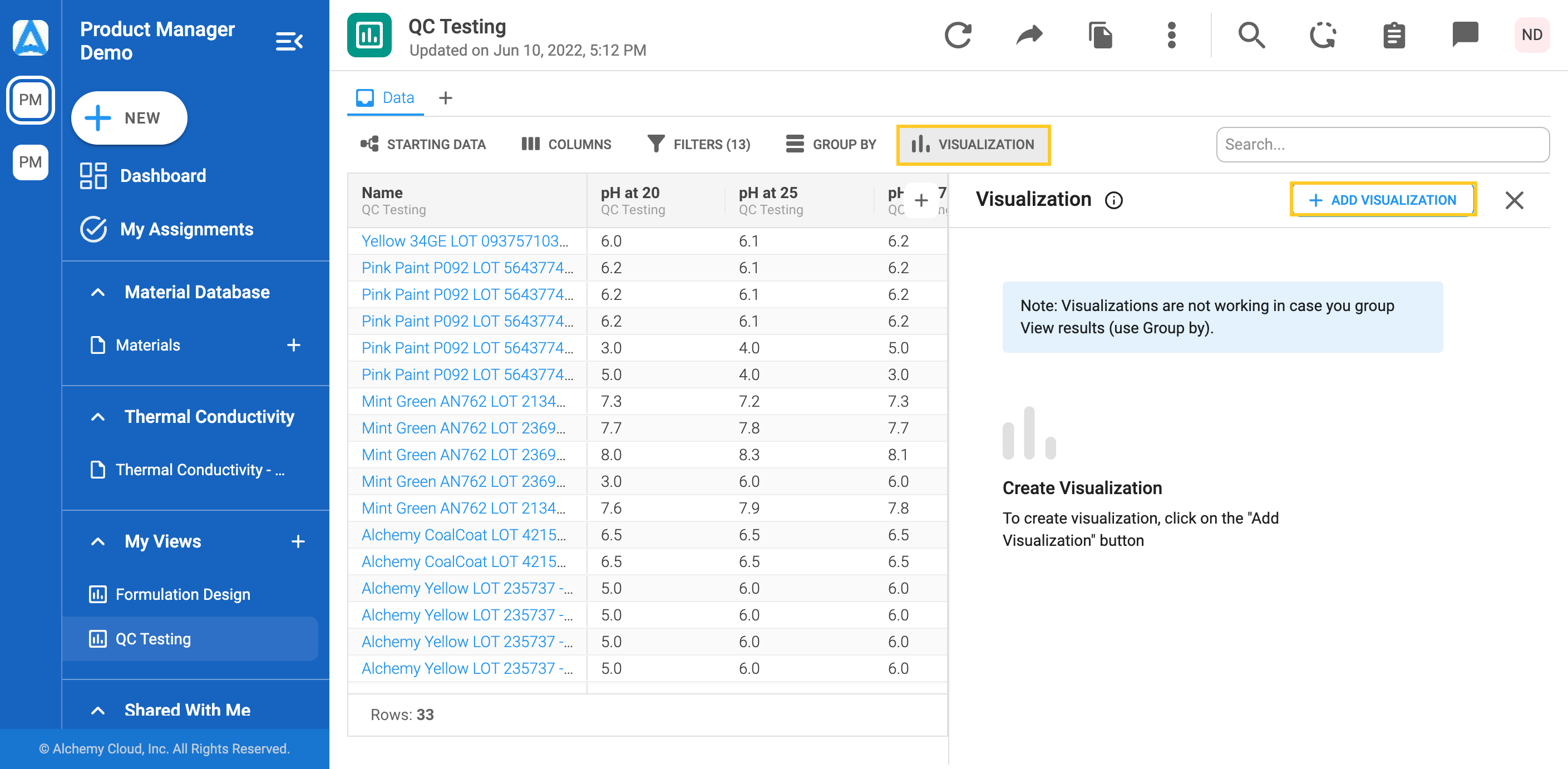
Predefined Views by your Admin do not enable creating the visualizations. Visualizations could be created only in Views within the My Views section. However, Predefined Views can be cloned and then edited. To clone a View, check this link.
Visualizations are not working in case you group View results (use Group by).
1. Click on the Visualization tab to open the visualization menu. Click on the “Add Visualization” and new visualization will be opened.
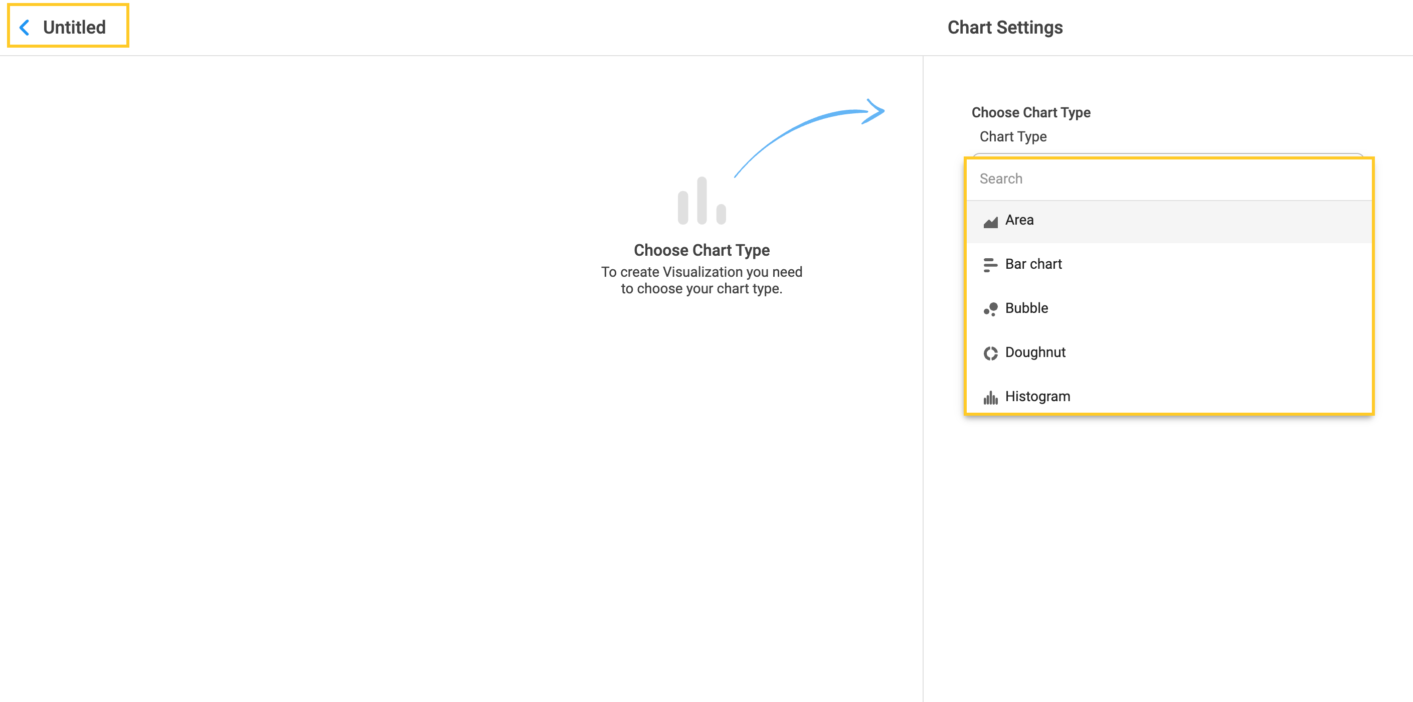
2. Click on “Untitled” to enter the name of the chart. Click on “Choose Chart Type” to choose among different chart types from the drop-down menu.
9.1 Area chart
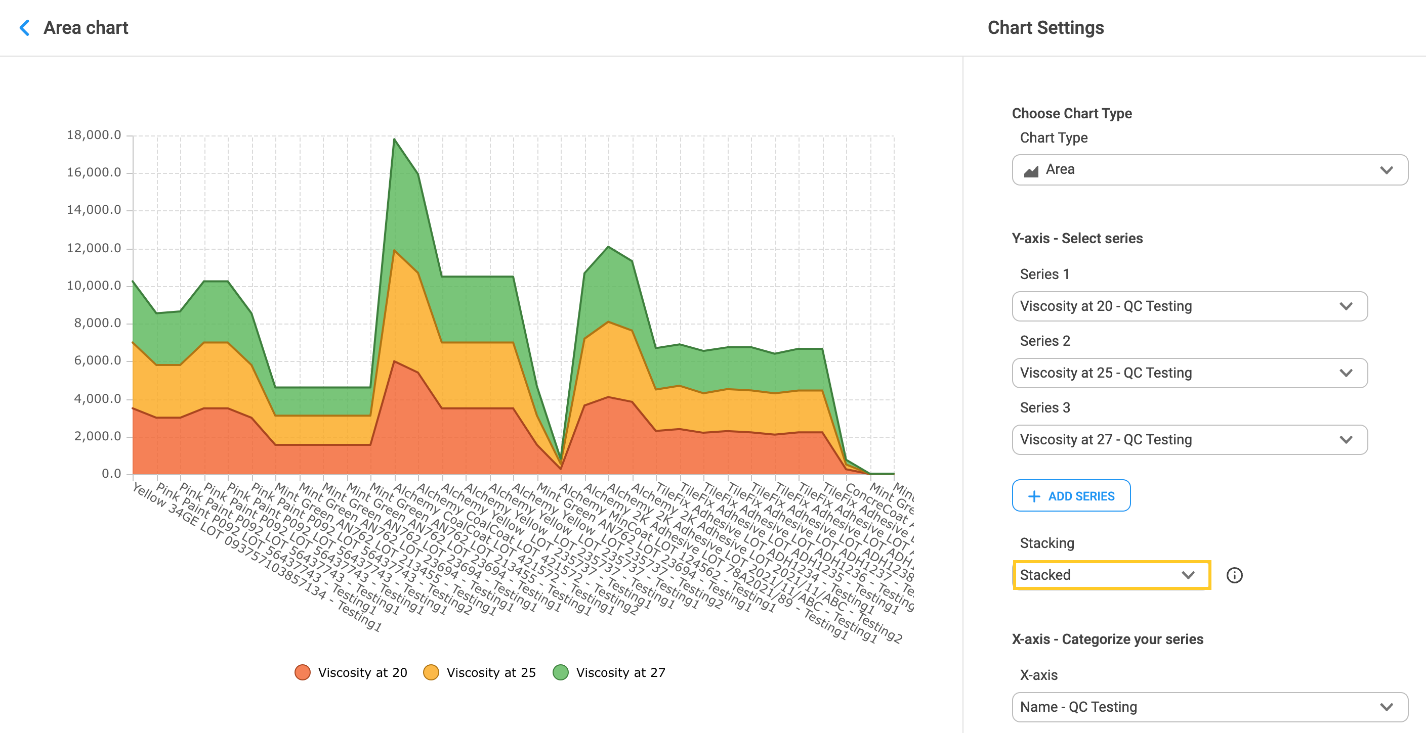
1. Choose the Area chart as the chart type. The area chart gives a visual representation of quantitative data and it is commonly used for comparison between different quantities. Select Series 1 data, which will be represented on the Y-axis and data to be placed on the X-axis.
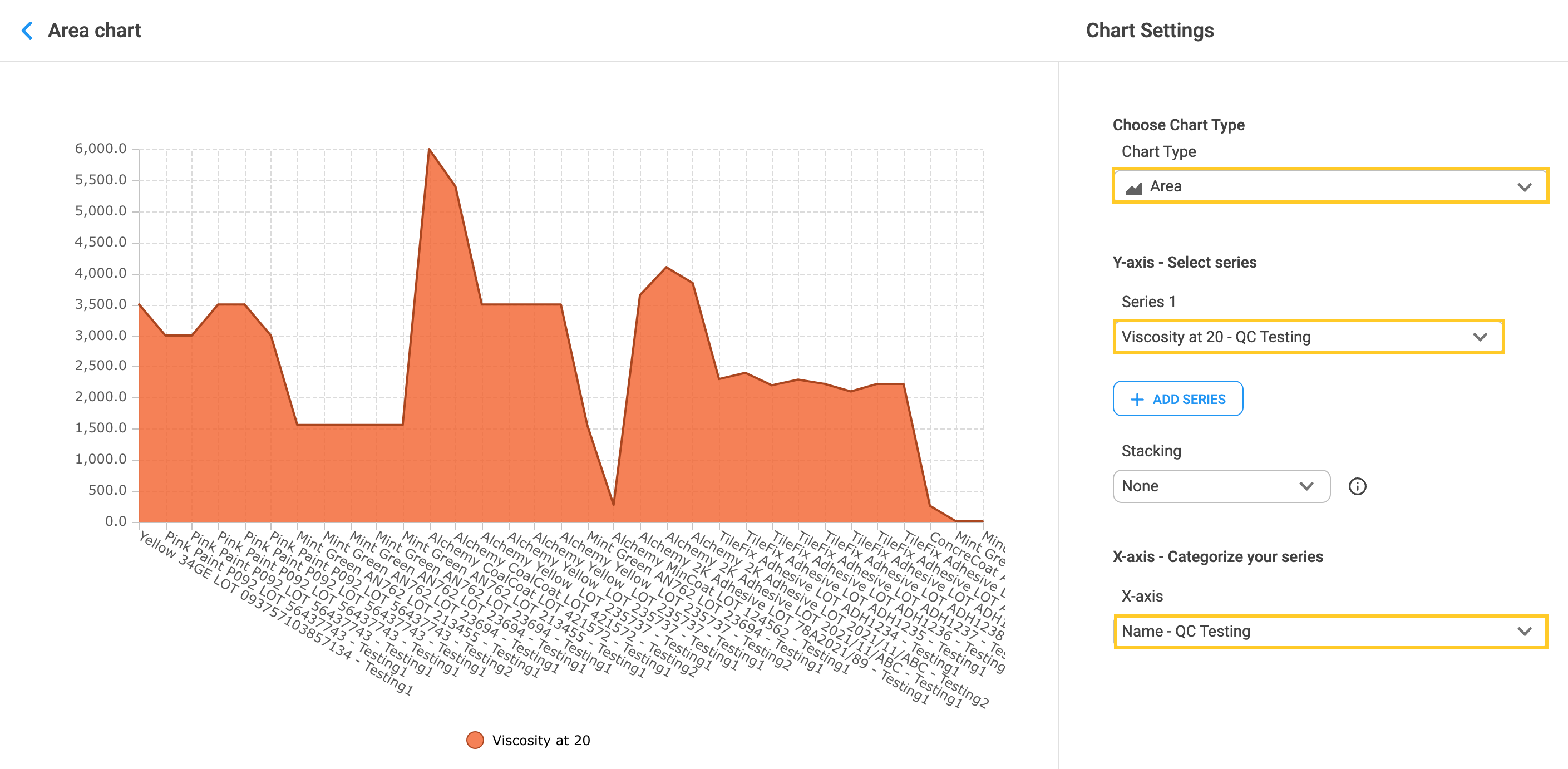
2. Click on the “Add Series” button to add more than one series.
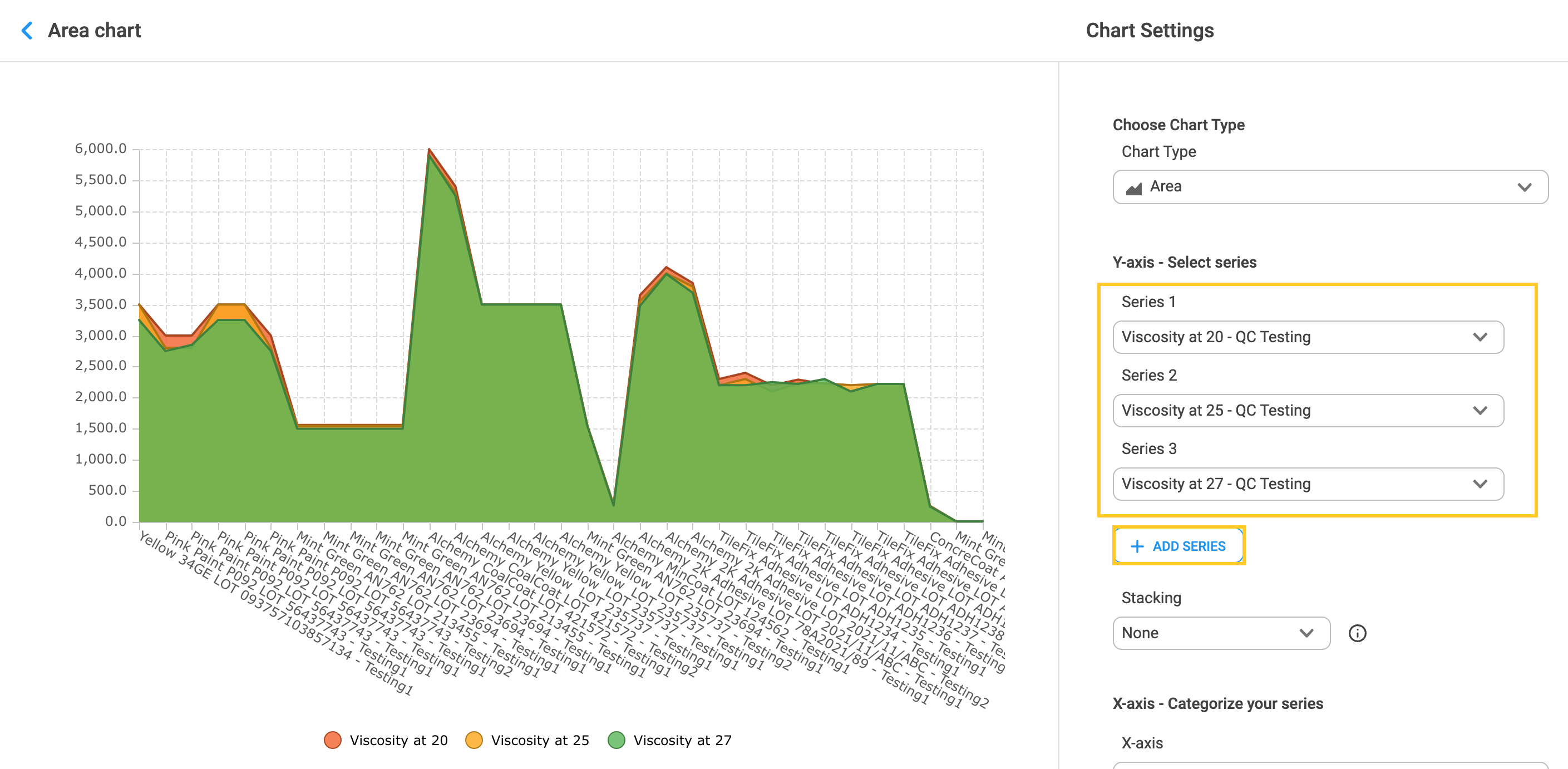
3. Click on an arrow below the “Stacking” label and choose the option “Stacked”. Areas are not overlapping if the “Stacked” option is chosen.
9.2 Bar Chart
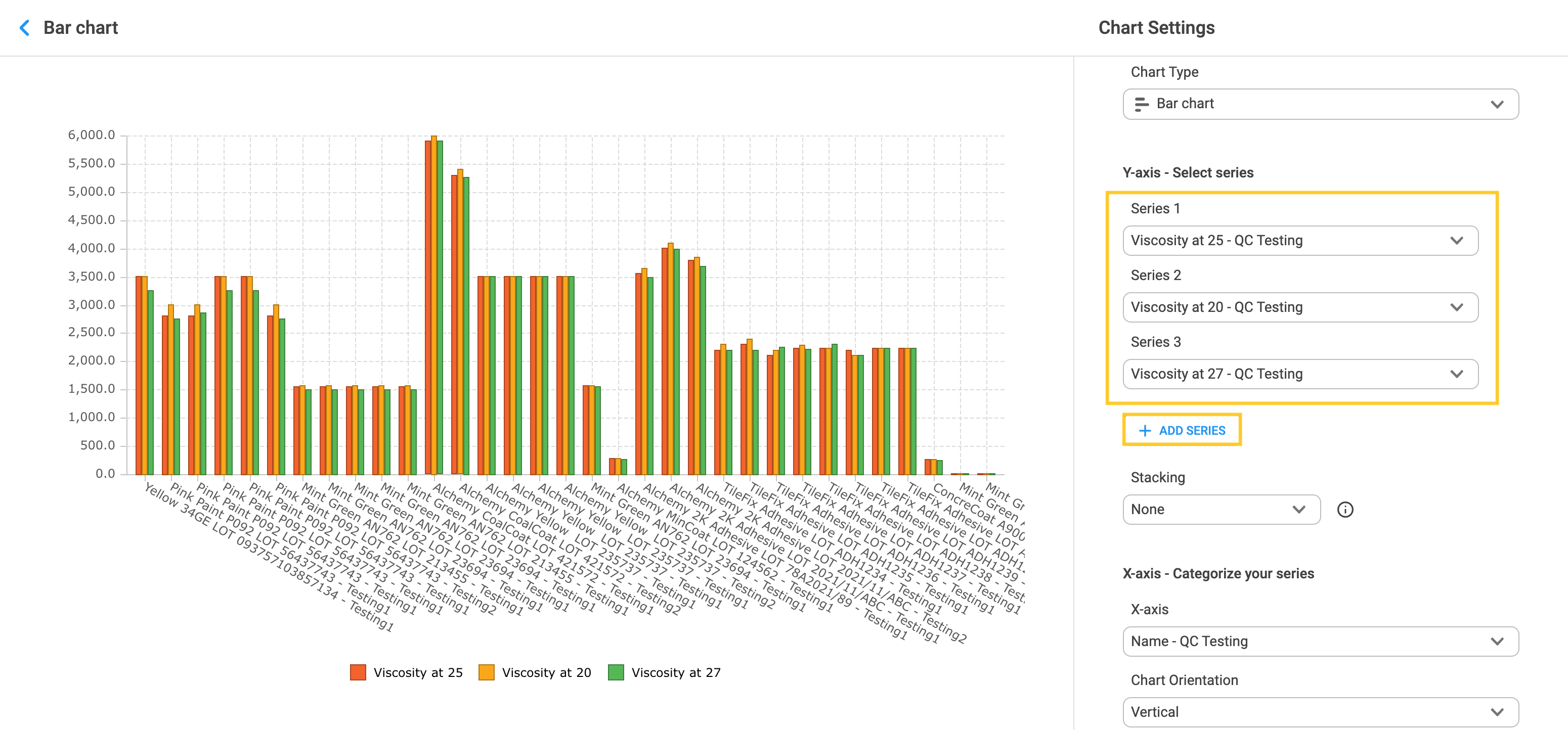
1. Choose “Bar chart” from the drop-down menu to compare data across the categories. Click on the arrow inside the “Series 1” field to choose the series data. Choose the data for X-axis by clicking on the arrow. Select the chart orientation among vertical or horizontal.
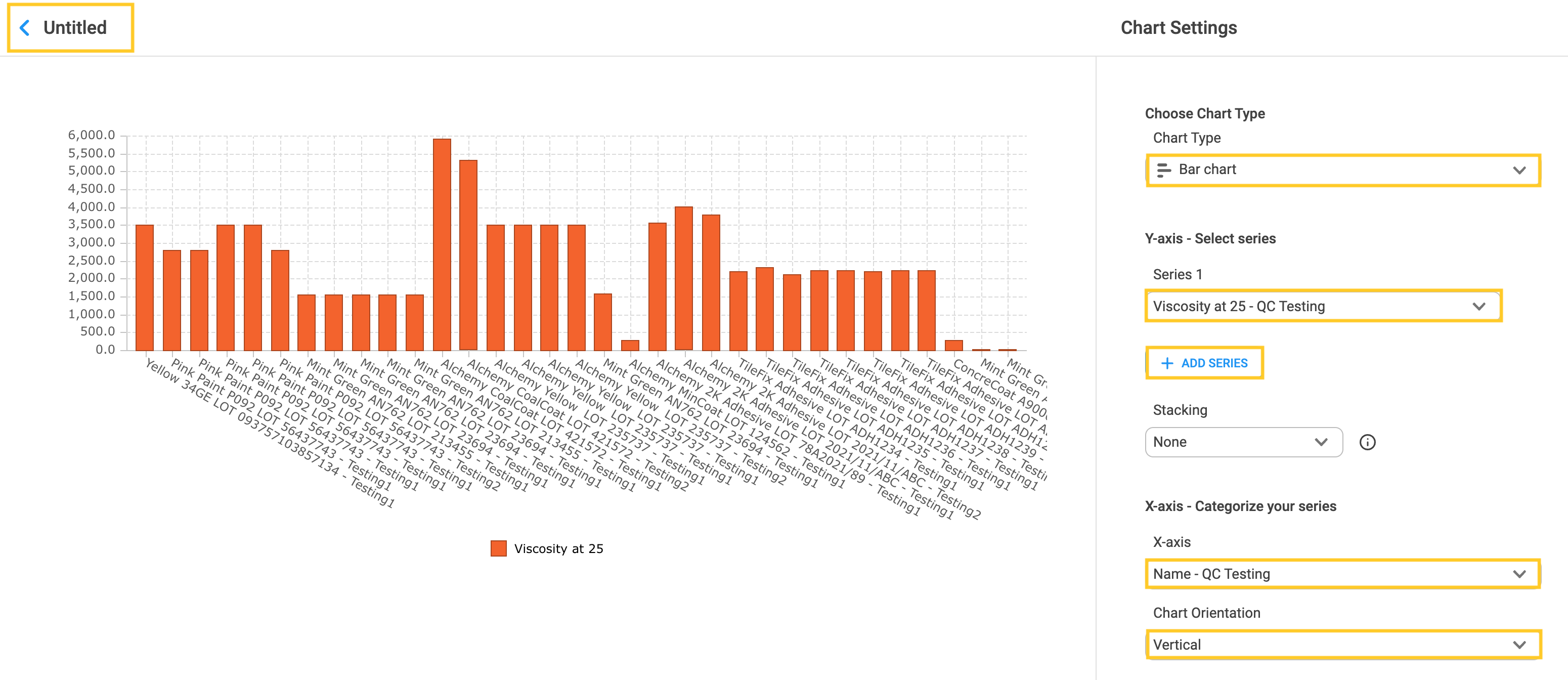
2. Click the “+Add series” button to include additional series. Click on the arrow inside the field of each series to select the data.
3. Creating the Bar chart from the Visualization tab is not the only way to create it in Alchemy. To learn more about creating Bar charts in Alchemy, visit Alternative ways to create Charts in a View.
9.3 Bubble chart
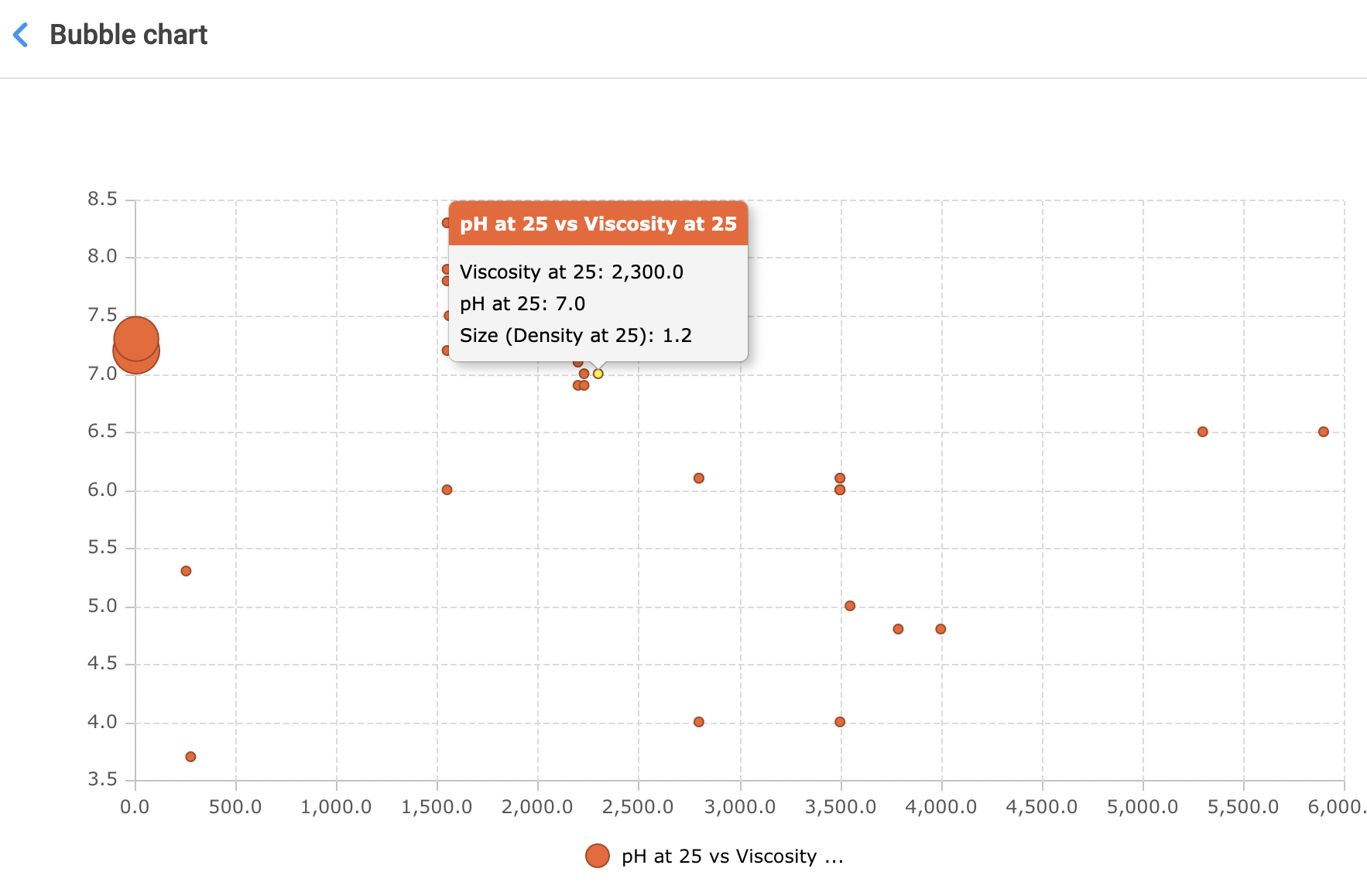
1. Choose the Bubble chart as the chart type. Click on the arrow to select the series of data, bubble size and X-axis data to categorize the series.
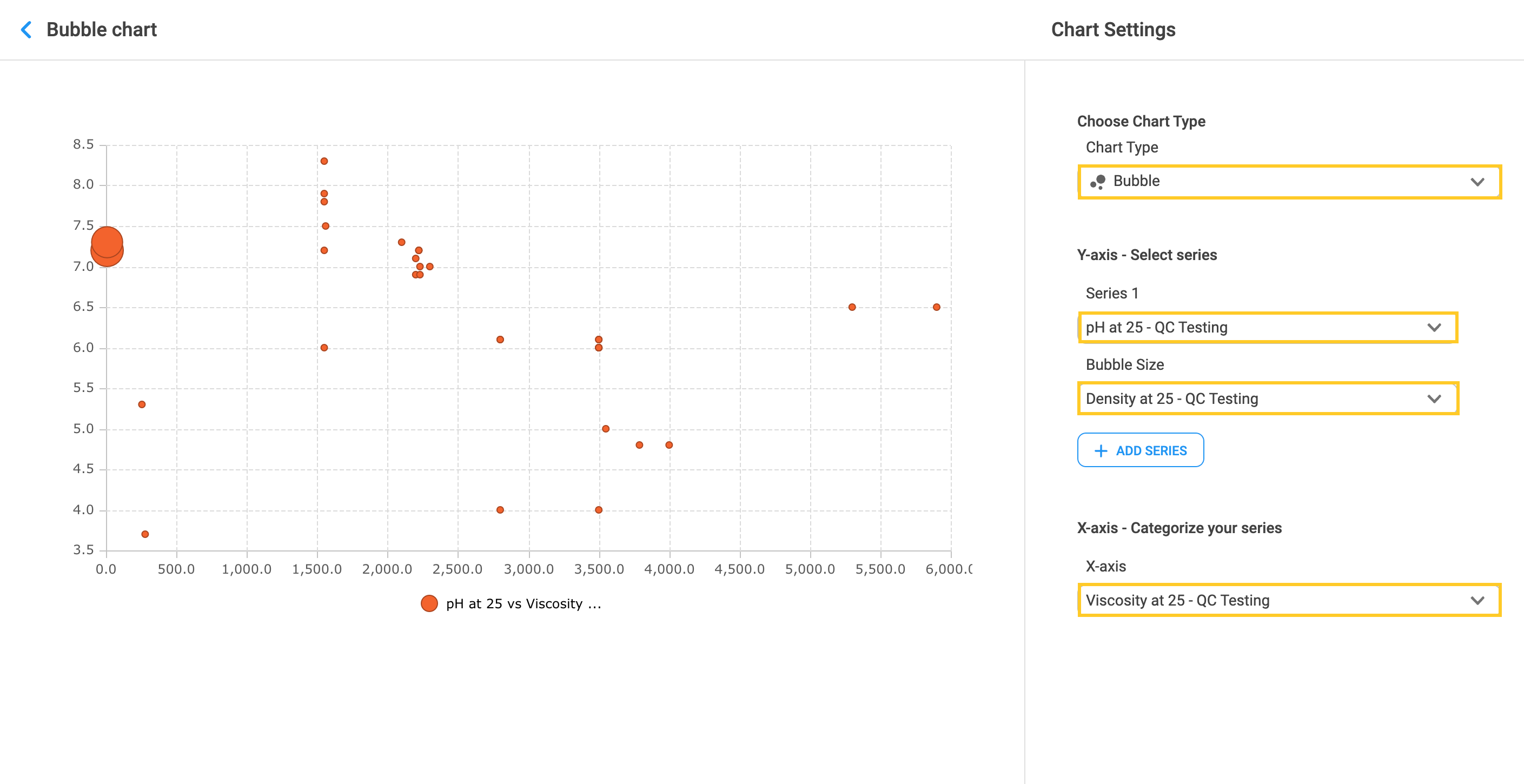
2. Hover over the bubble to display the results.
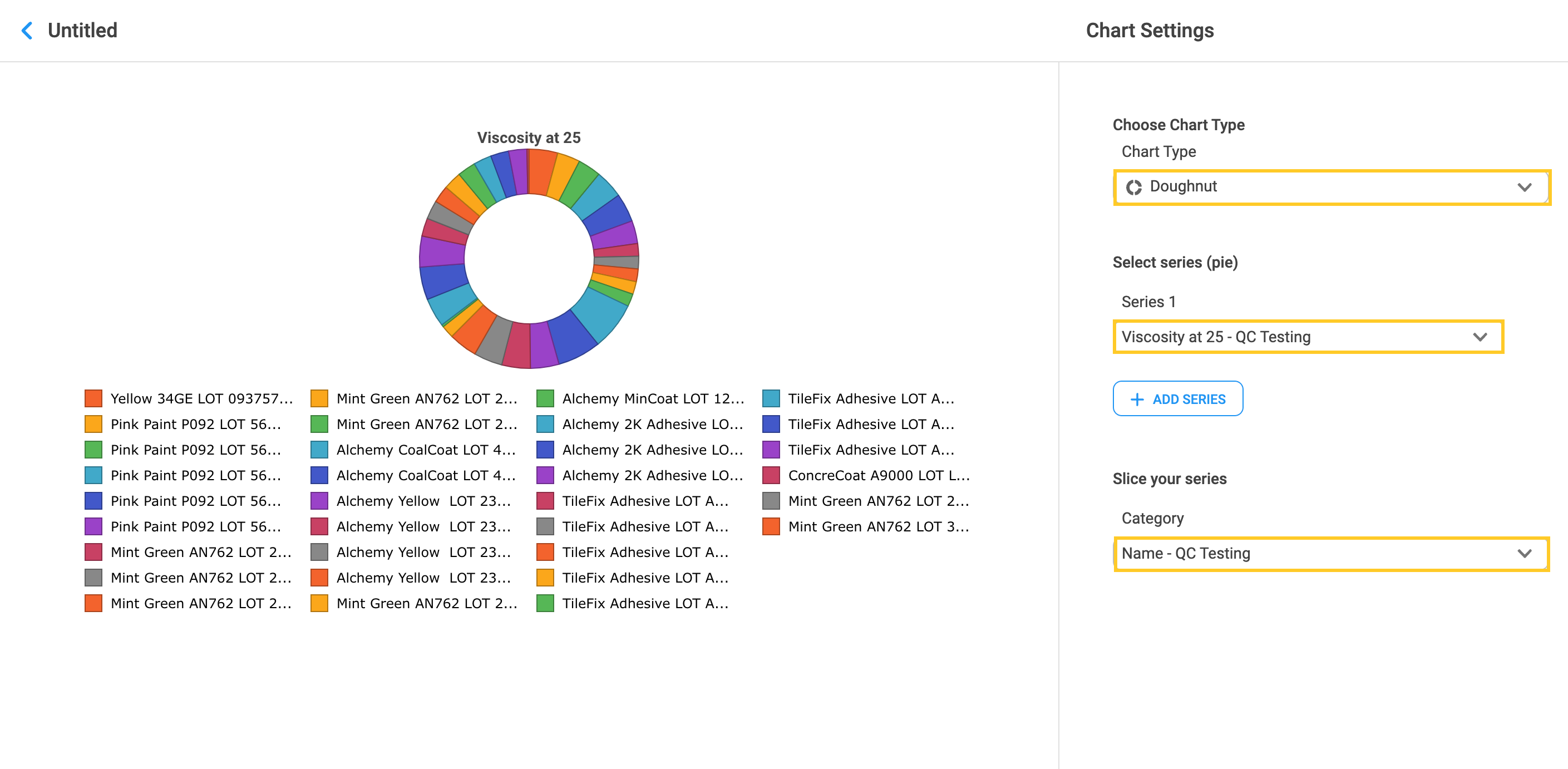
9.4 Doughnut
1. Choose Doughnut as the chart type. Doughnut chart is a variation of the Pie chart. Select the data series and category by which the series will be sliced.
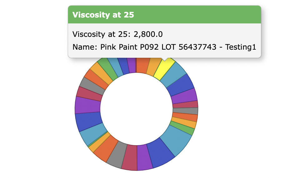
2. Hovering over to show the values of the slice.
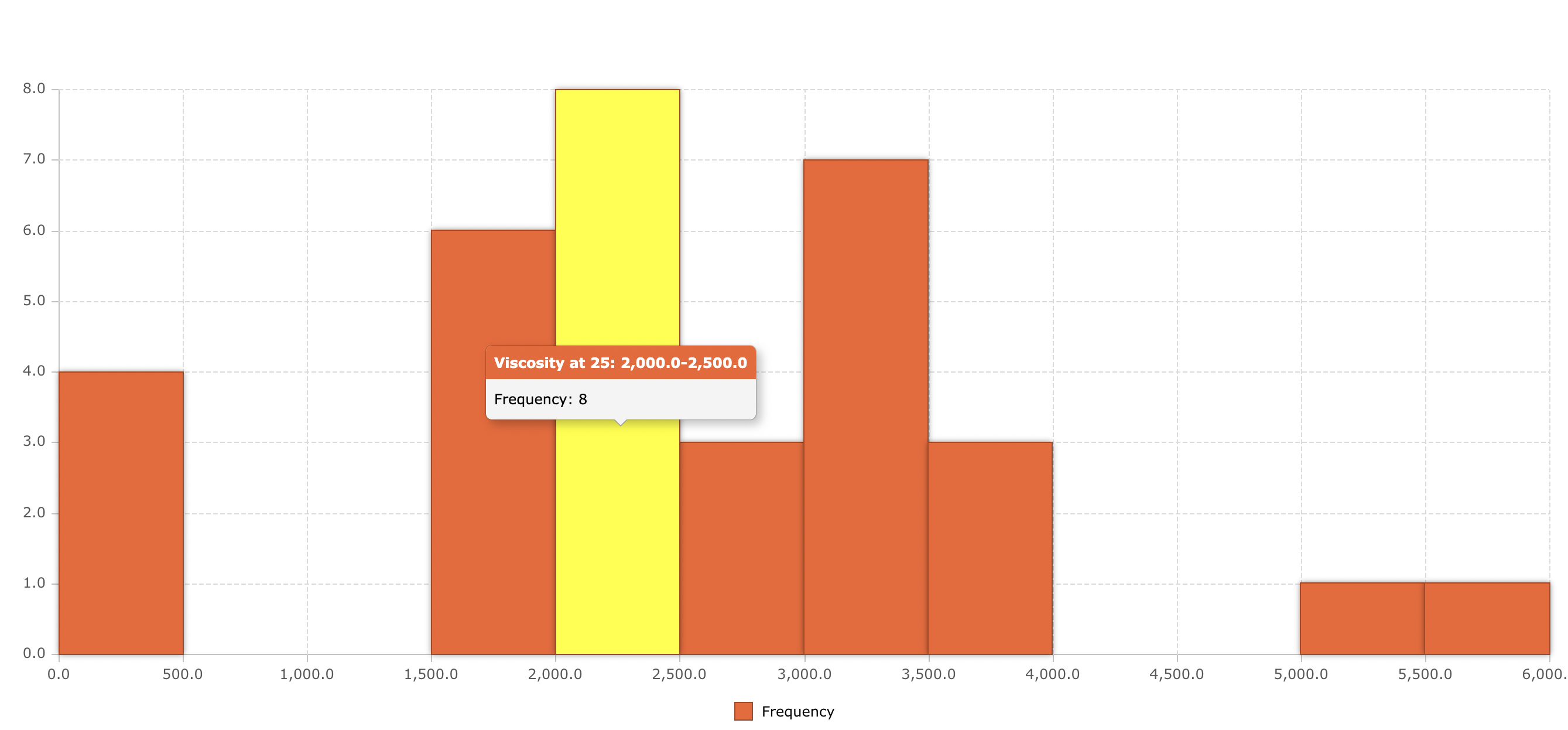
9.5 Histogram
1. Choose Histogram as a chart type to see the data distribution. Select the series of data and category by which the series will be categorized.
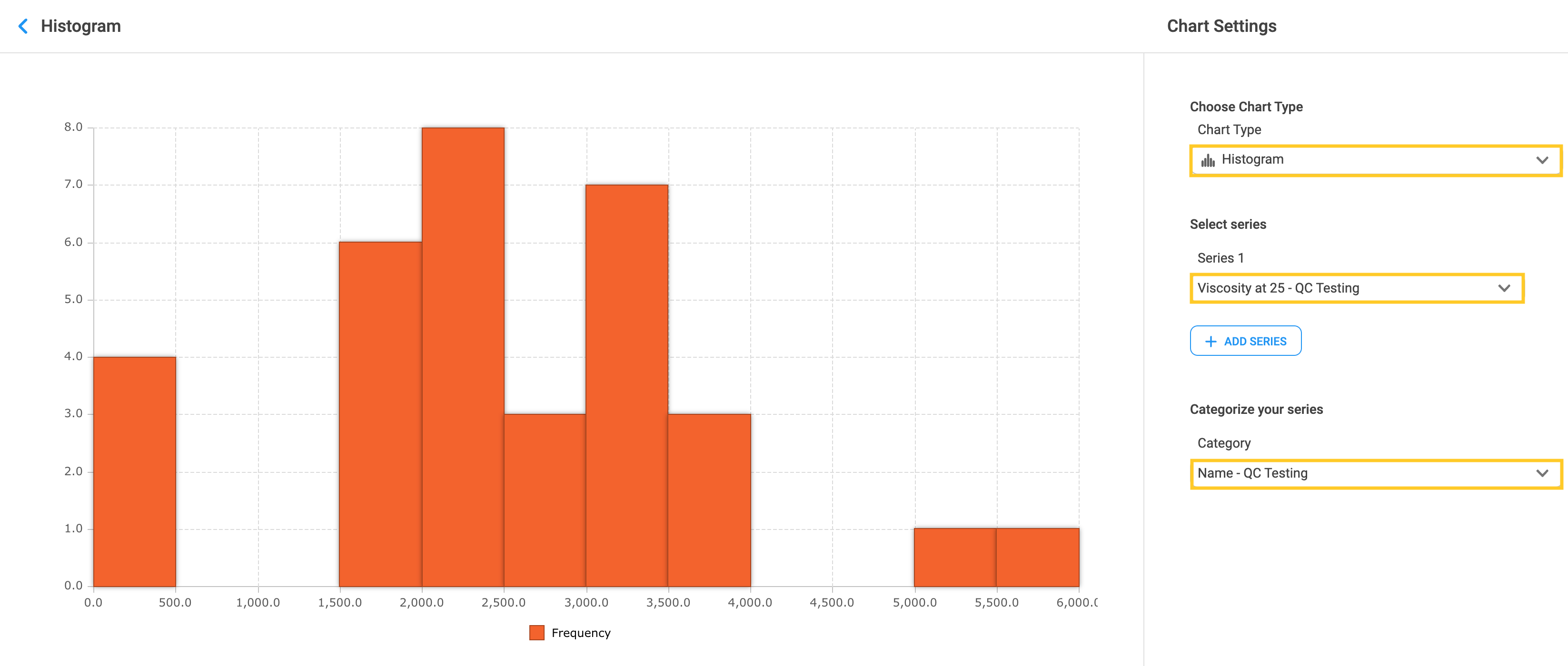
2. Hover over the specific bar to display the frequency of data points in the bar interval.
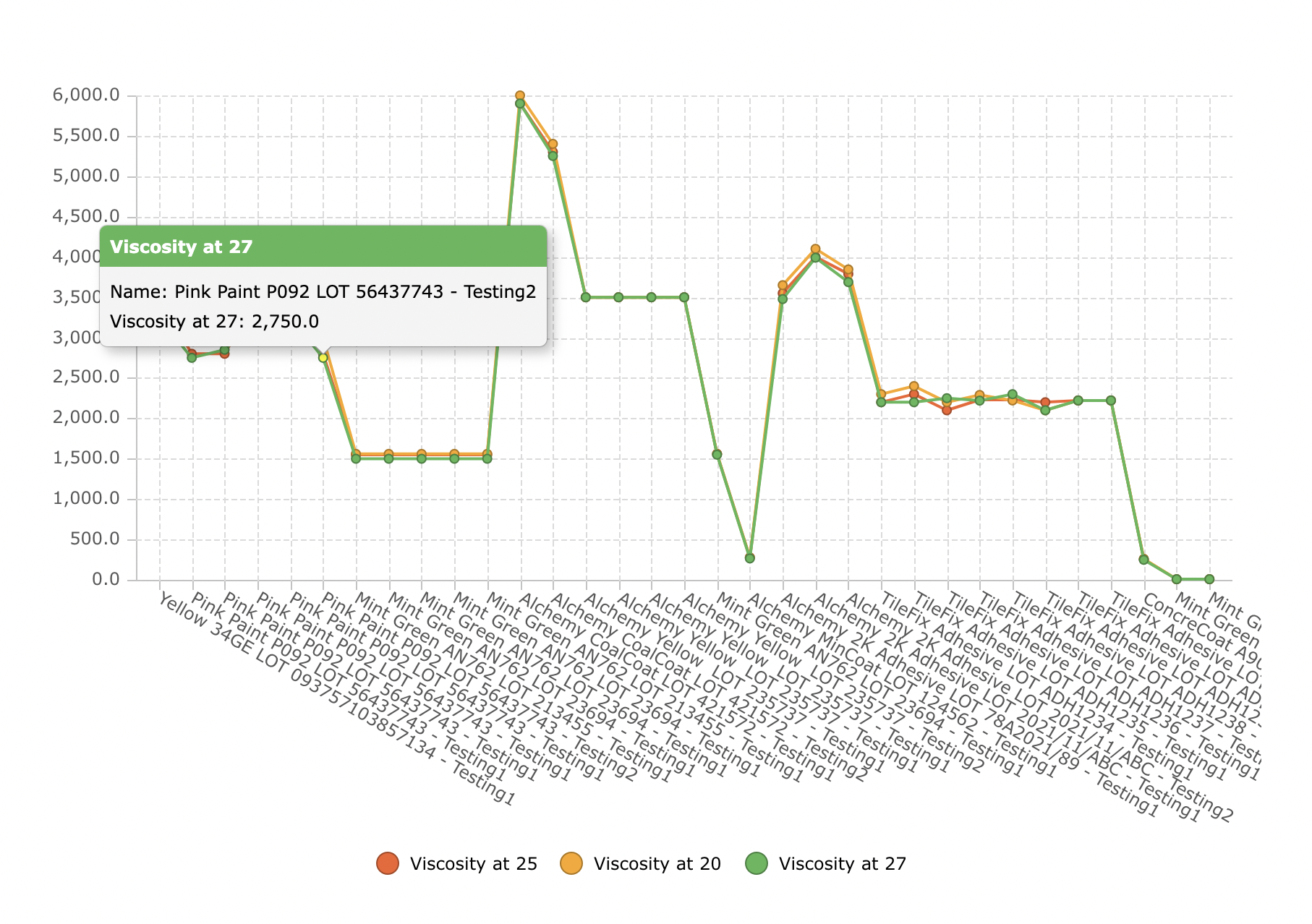
9.6 Line chart
1. Line chart connects individual numeric data points. Choose Line chart as the chart type, if you want to see the trends over a period of time. Select the series of data and X-axis data.
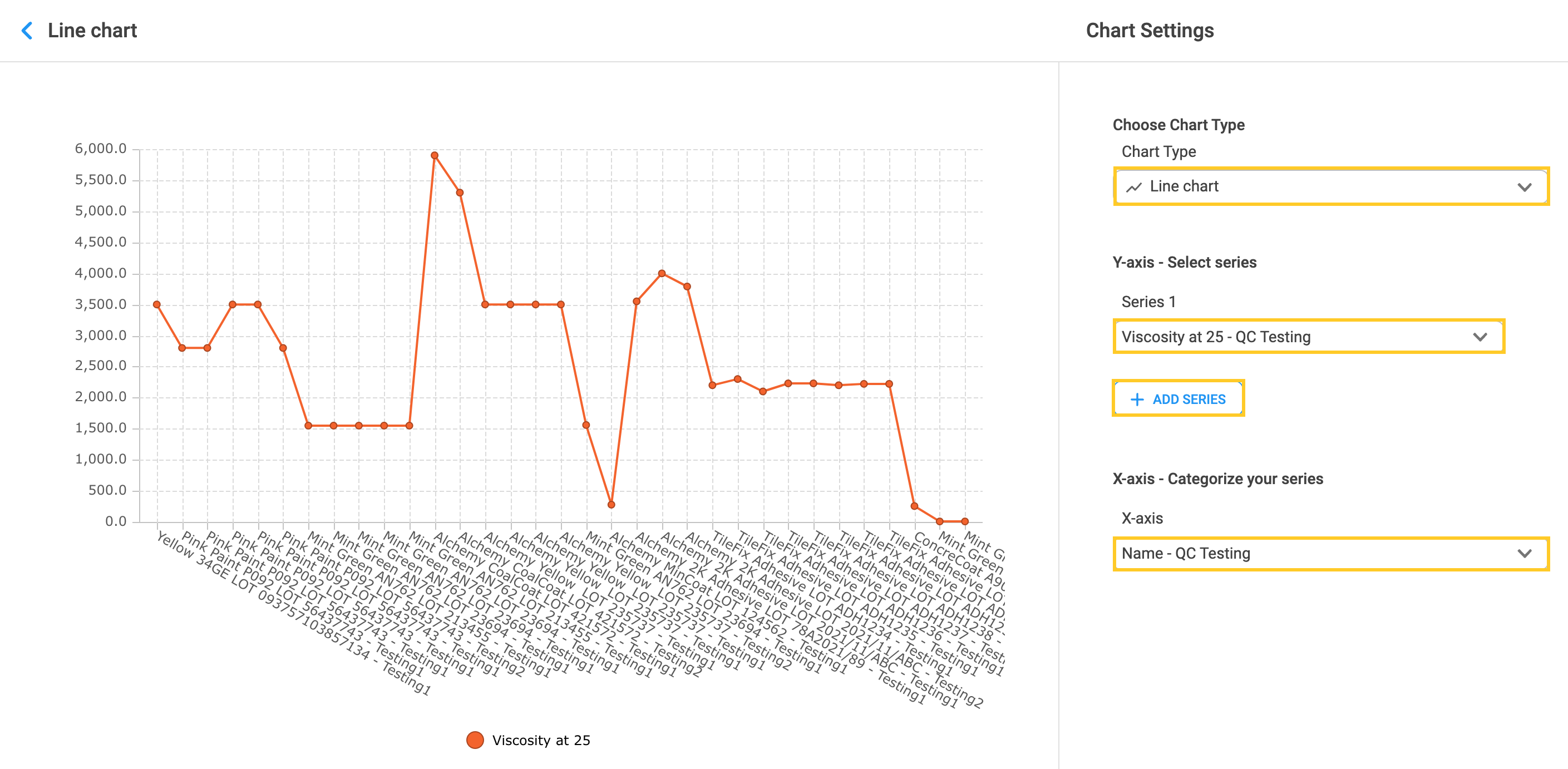
2. Click on the “Add series” button to add more than one line and visually compare the data.
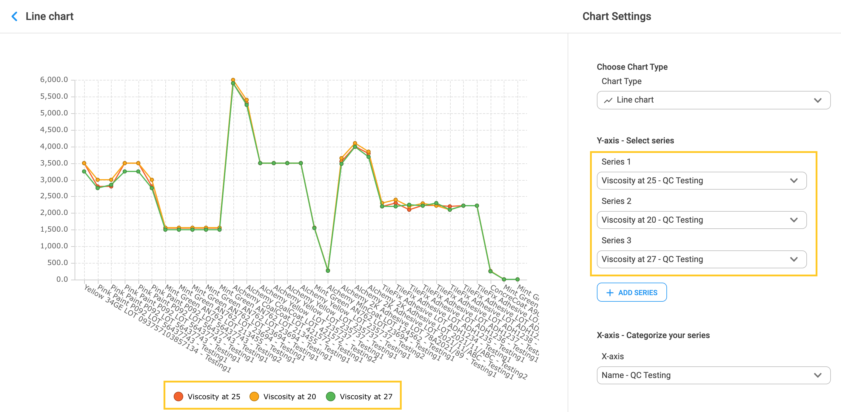
3. Hover over the line to show the results for each data point placed on X-axis.
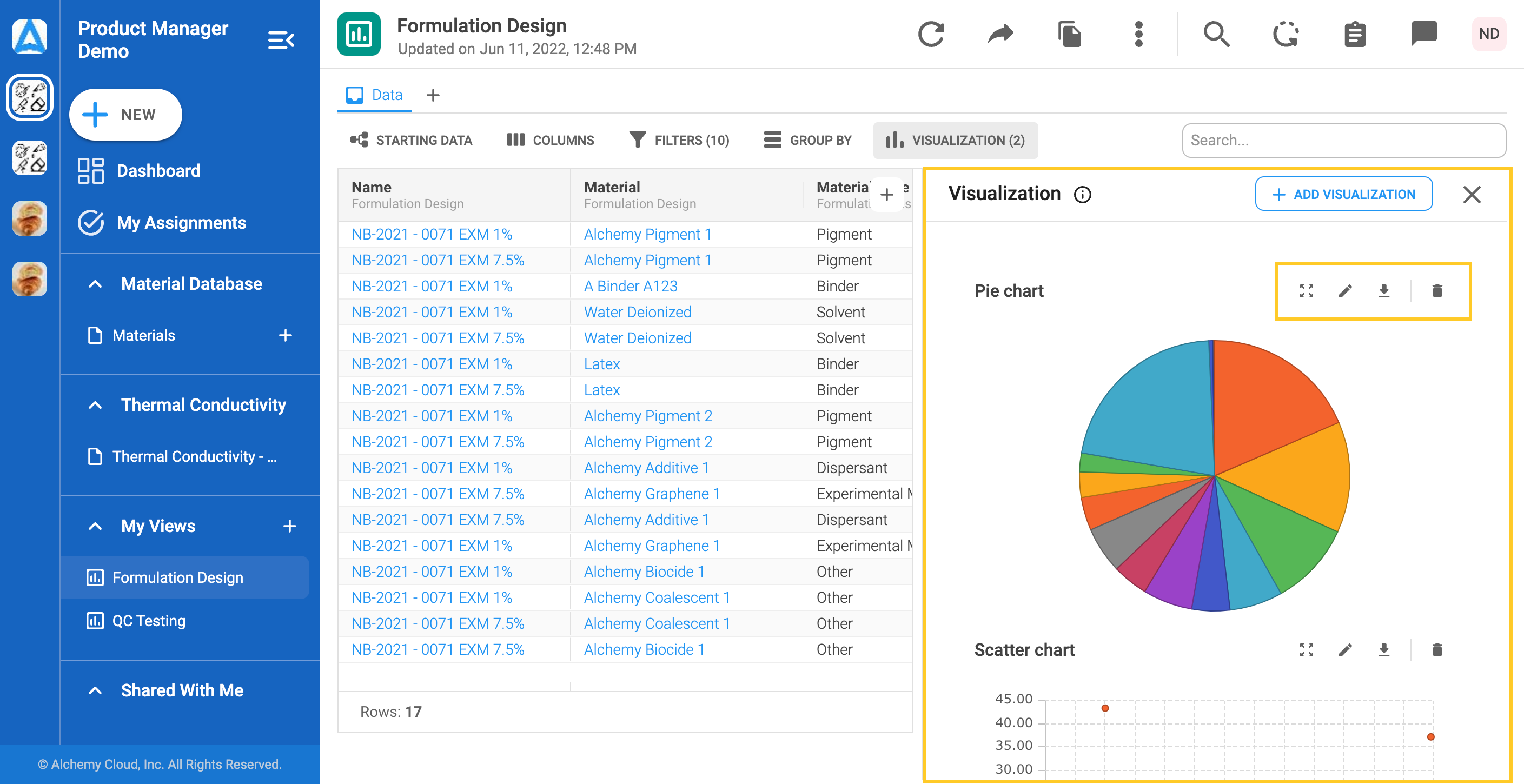
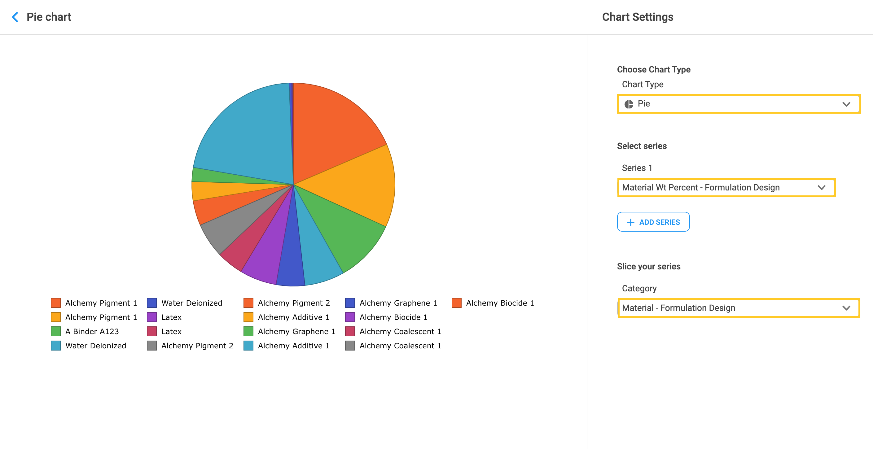
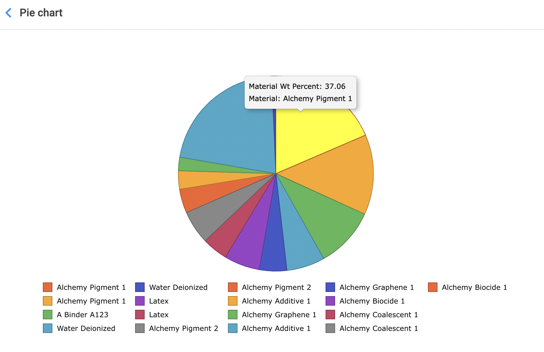
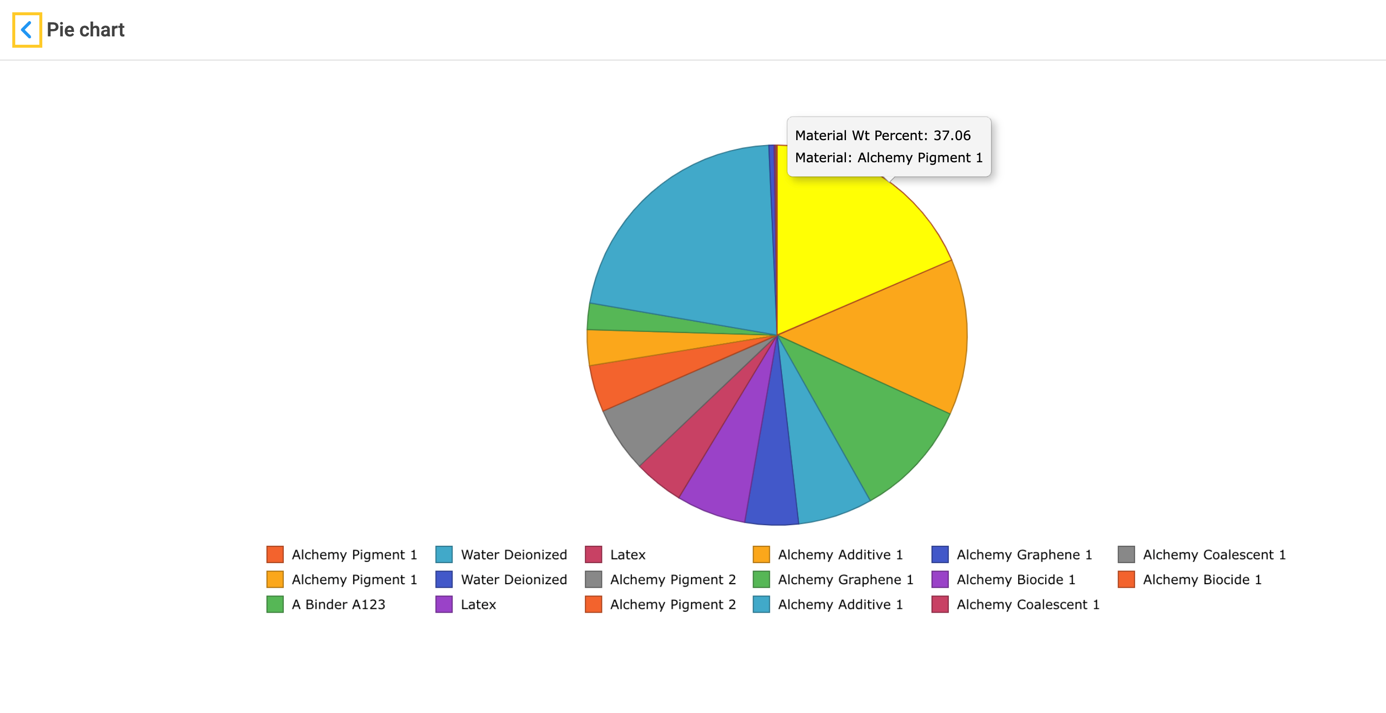
9.7 Pie chart
1. Choose Pie chart as the chart type to show proportions of the data. Select the data series and category by which the series will be sliced.
2. Hover over the slice to show its value.
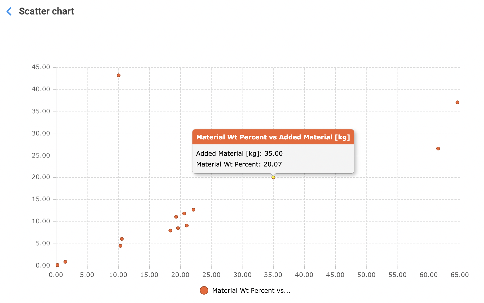
9.8 Scatter chart
1. Choose Scatter as the chart type. Scatter plots are used to observe the relationship and investigate correlation between two different numeric variables. Select the Series 1 data and X-axis data.
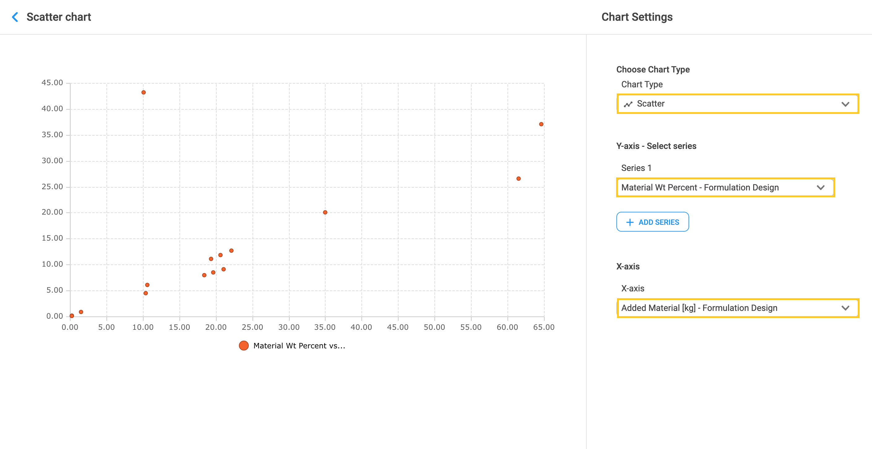
2. Hover over the dot to display its value.
3. Creating Scatter plots from the Visualization tab is not the only way to create them in Alchemy. To learn more about creating Scatter plots in Alchemy, visit Alternative ways to create Charts in a View.
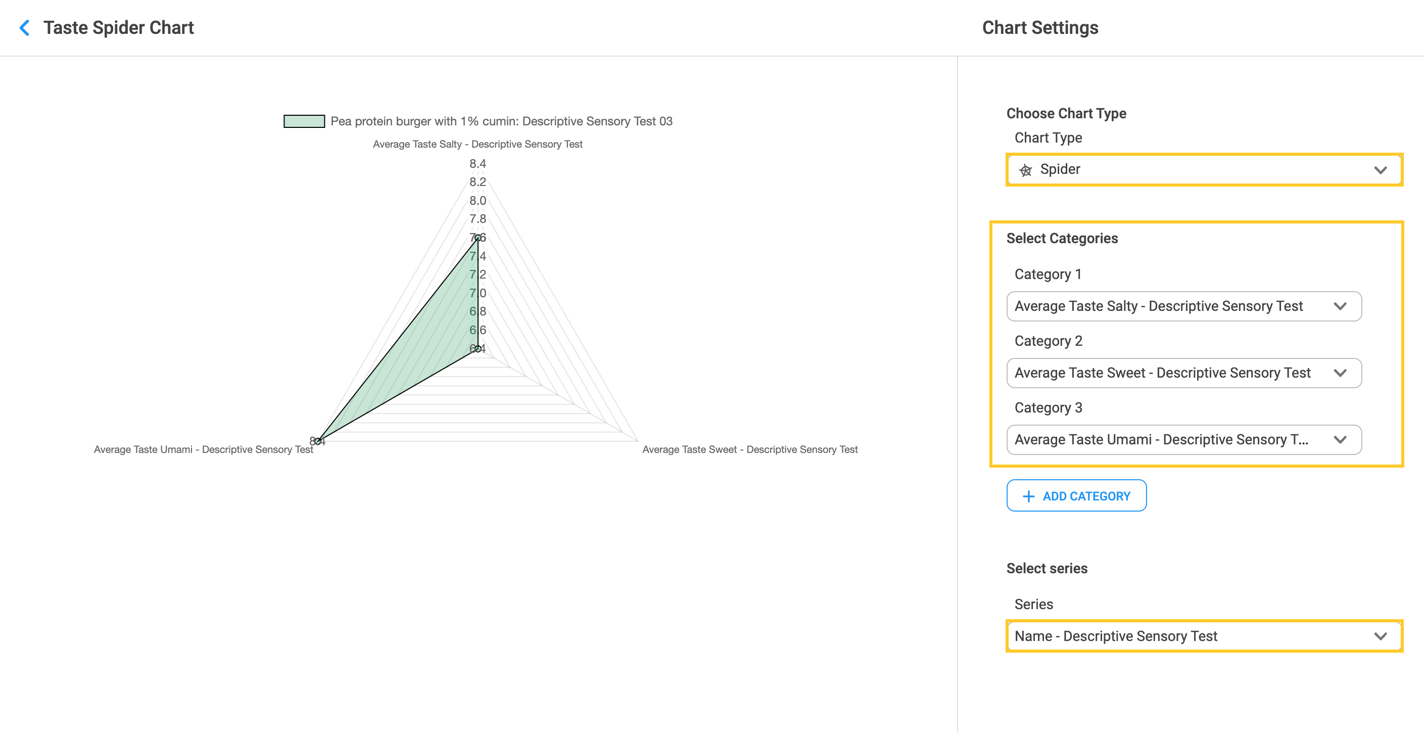
9.9 Spider chart
1. Choose the Spider chart as a chart type. Use this two-dimensional chart when you want to plot one or more series of data across several unique dimensions. Within the “Select Categories” section click on the arrow inside the category field to choose the specific category. Select at least two categories. Within the “Select series” click on the arrow inside the series field to select the appropriate data series.
9.10 Expanding, Editing, Downloading and Deleting Charts
1. Click on the arrow next to the chart title to go back. This will lead you to the View page.
2. Visualizations will be seen in the thumbnail. For each chart, you can choose to Expand, Edit, Download (as .png image) or Delete the chart.